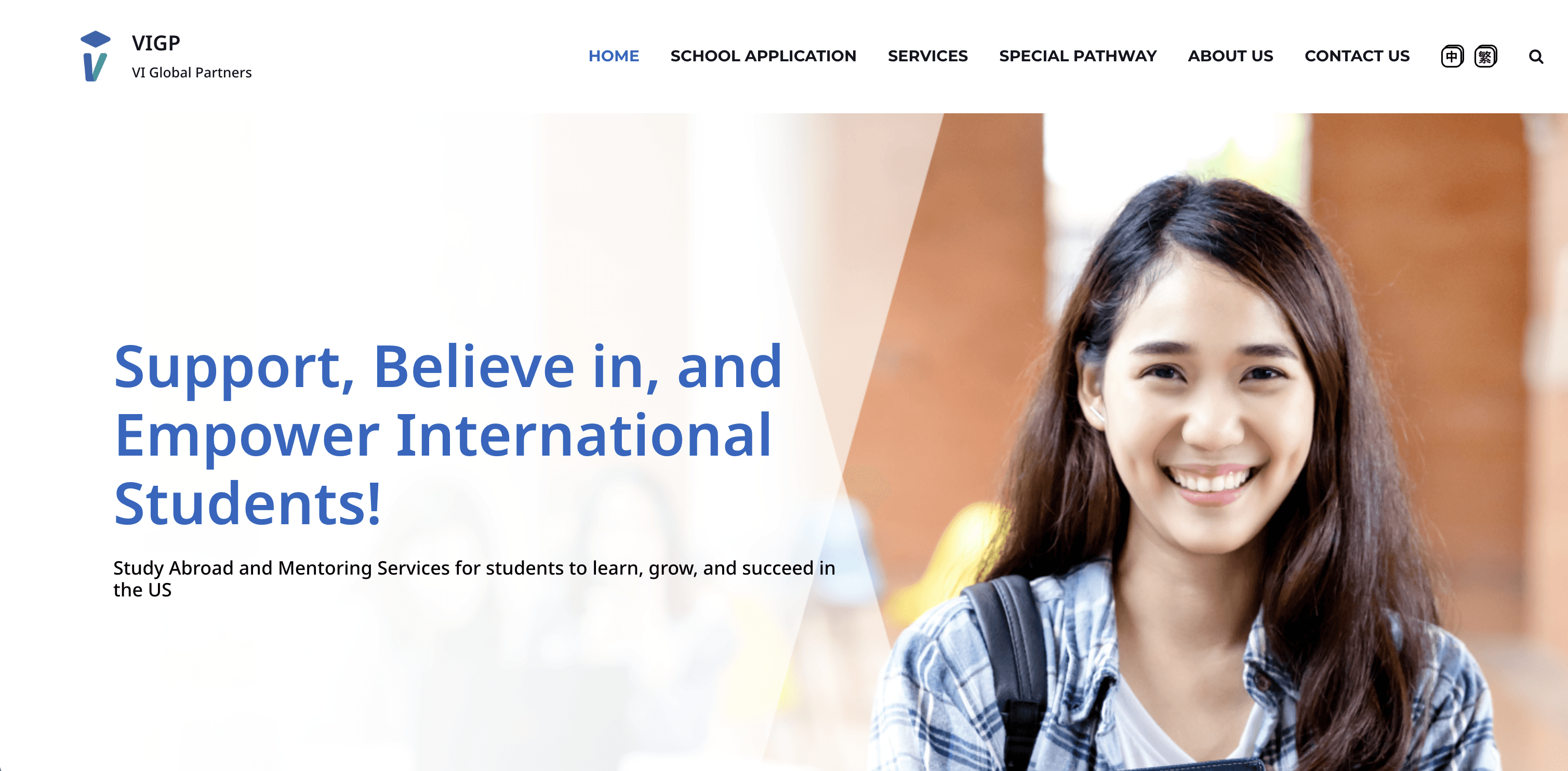
Education Platform — University Application Support Website
Redesigned a university application support website for an international education consultancy, restructuring the information architecture and visual design to help prospective students quickly understand services and take action — resulting in 2x more inquiries and 80% of users reporting improved findability.
Role
Product Designer
Industry
Education / EdTech
Duration
3 months
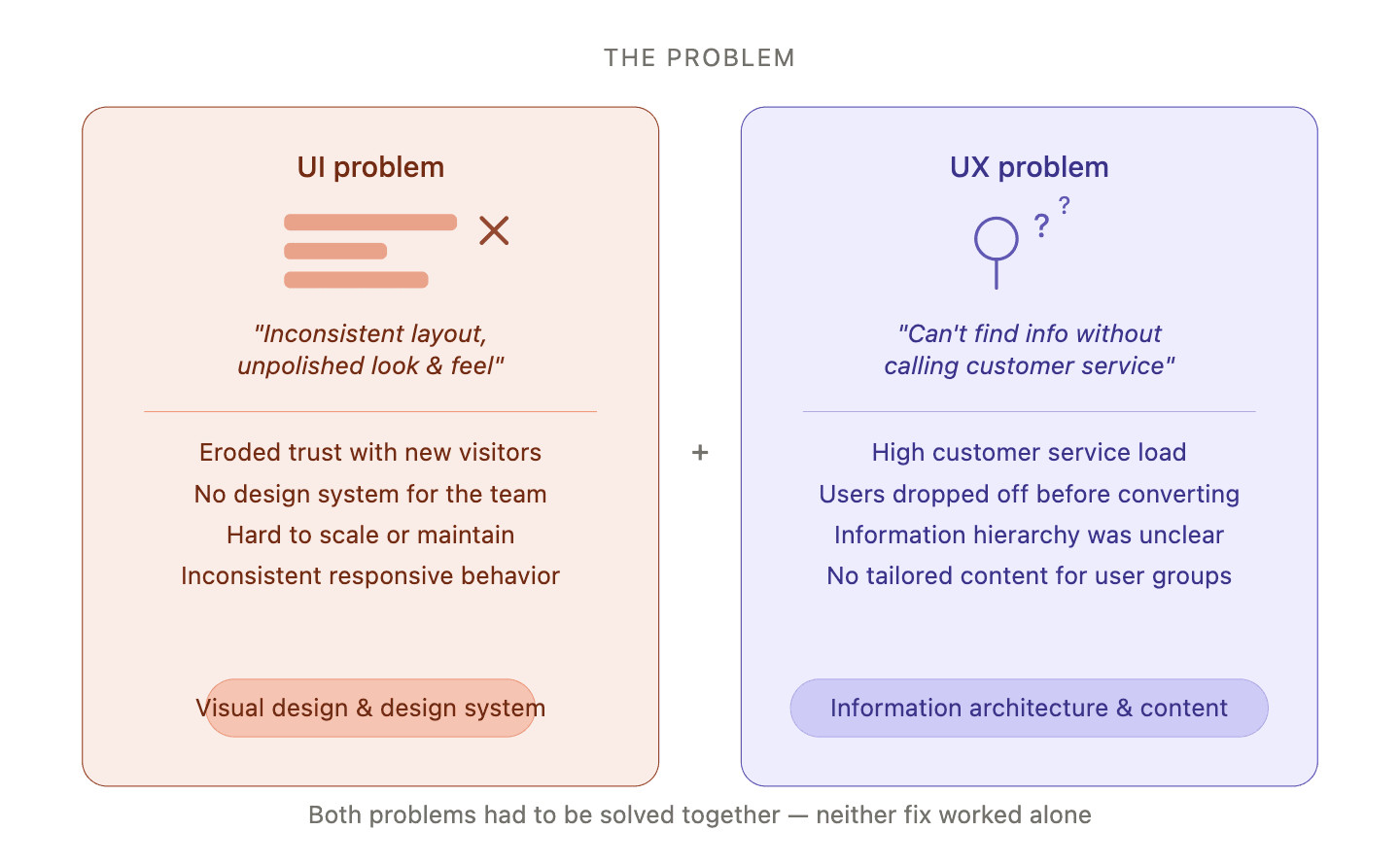
Problem:
Two distinct pain points were stalling the business:
UI: The existing site lacked a consistent layout and grid system, making it feel unpolished and hard to trust.
UX: Users couldn't find the information they needed without contacting customer service — a major friction point that was costing leads.
My Role and Approach:
End-to-end product design, including user research, competitive analysis, information architecture, UI design, responsive design, design system creation, and QA.
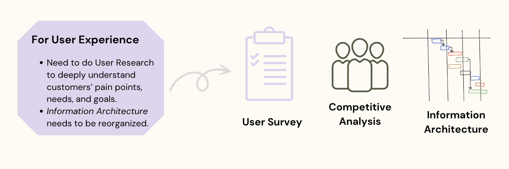
Research:
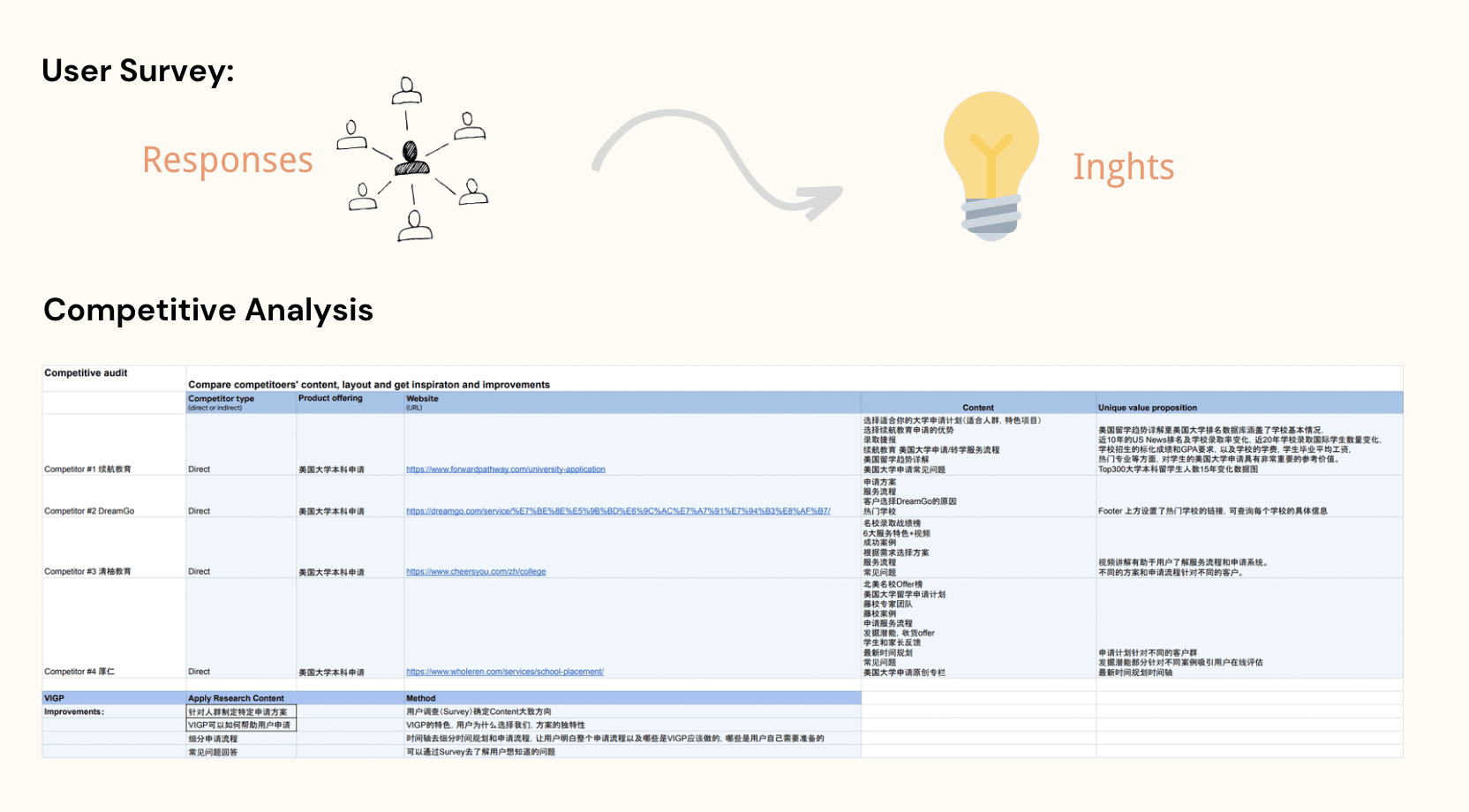
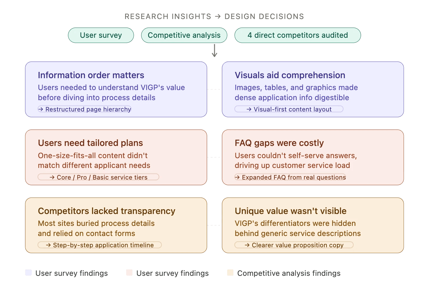
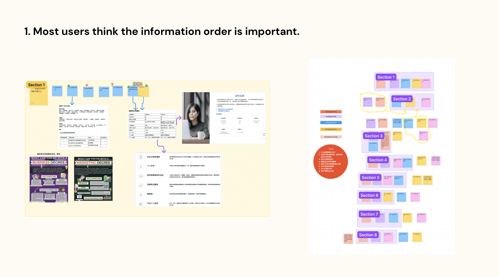
User Survey — Collected responses to understand what information users actually needed, in what order, and how they preferred it presented. Key insights:
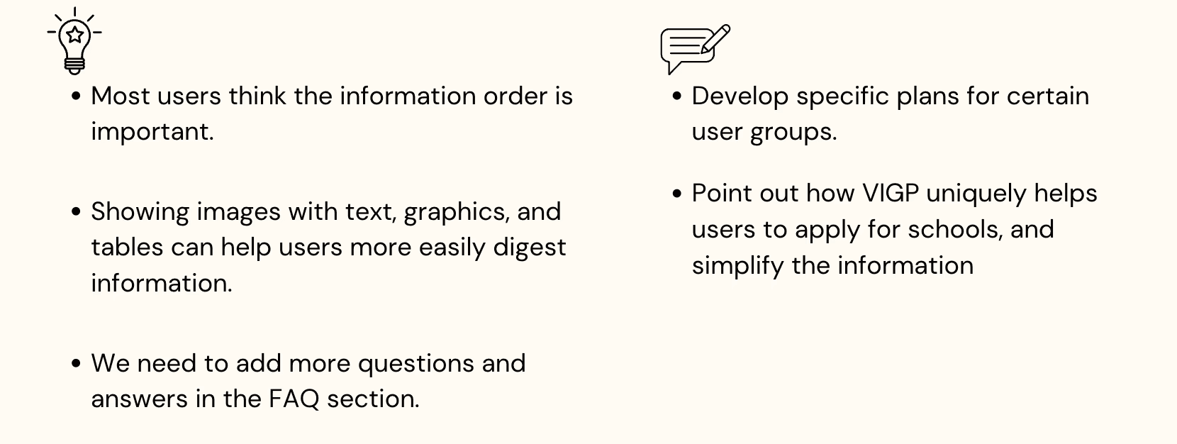
Information hierarchy matters: users wanted to understand what VIGP does and why to choose them before diving into process details.
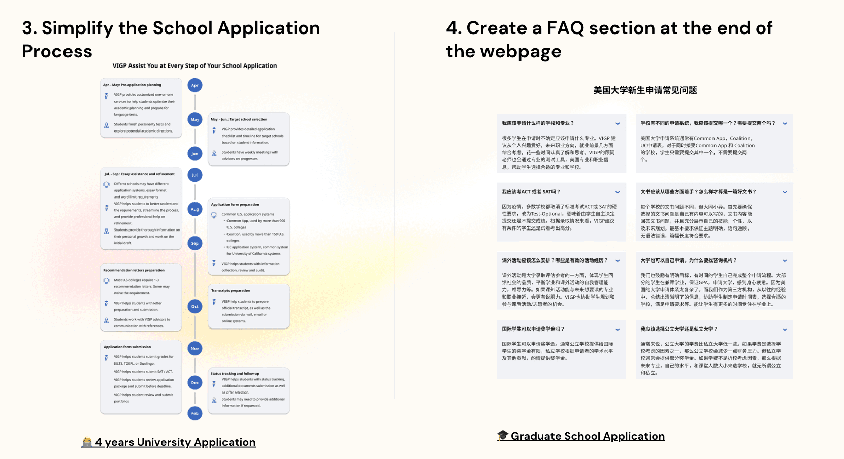
Visual formats (images, tables, graphics) made dense application info easier to digest.
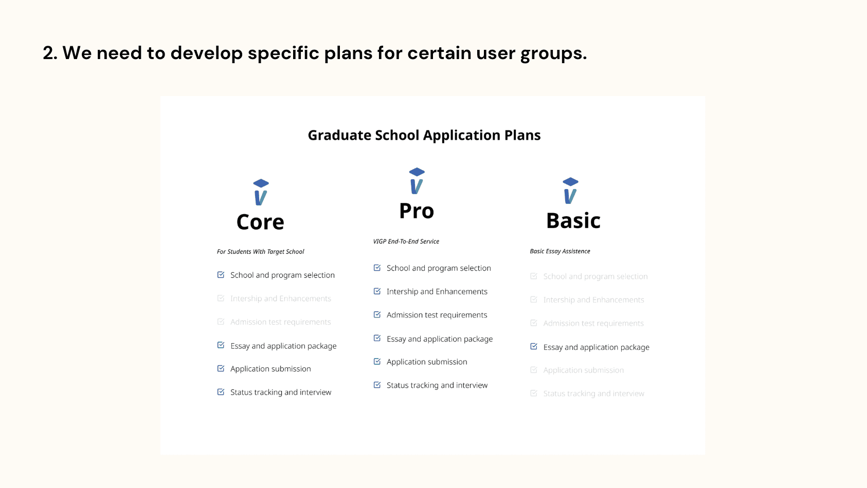
Users wanted tailored service plans, not one-size-fits-all content.
The FAQ section was inadequate for real user questions.
Competitive Analysis — Audited 4 direct competitors (including 续航教育, DreamGo, 清柚教育, 厚仁) to benchmark content structure, unique value propositions, and navigation patterns. Identified gaps where VIGP could differentiate.
Insights:
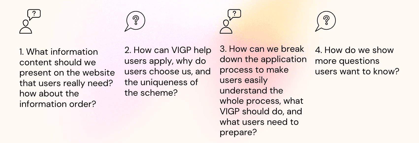
Define & Ideate:
Turned research into four core design questions:
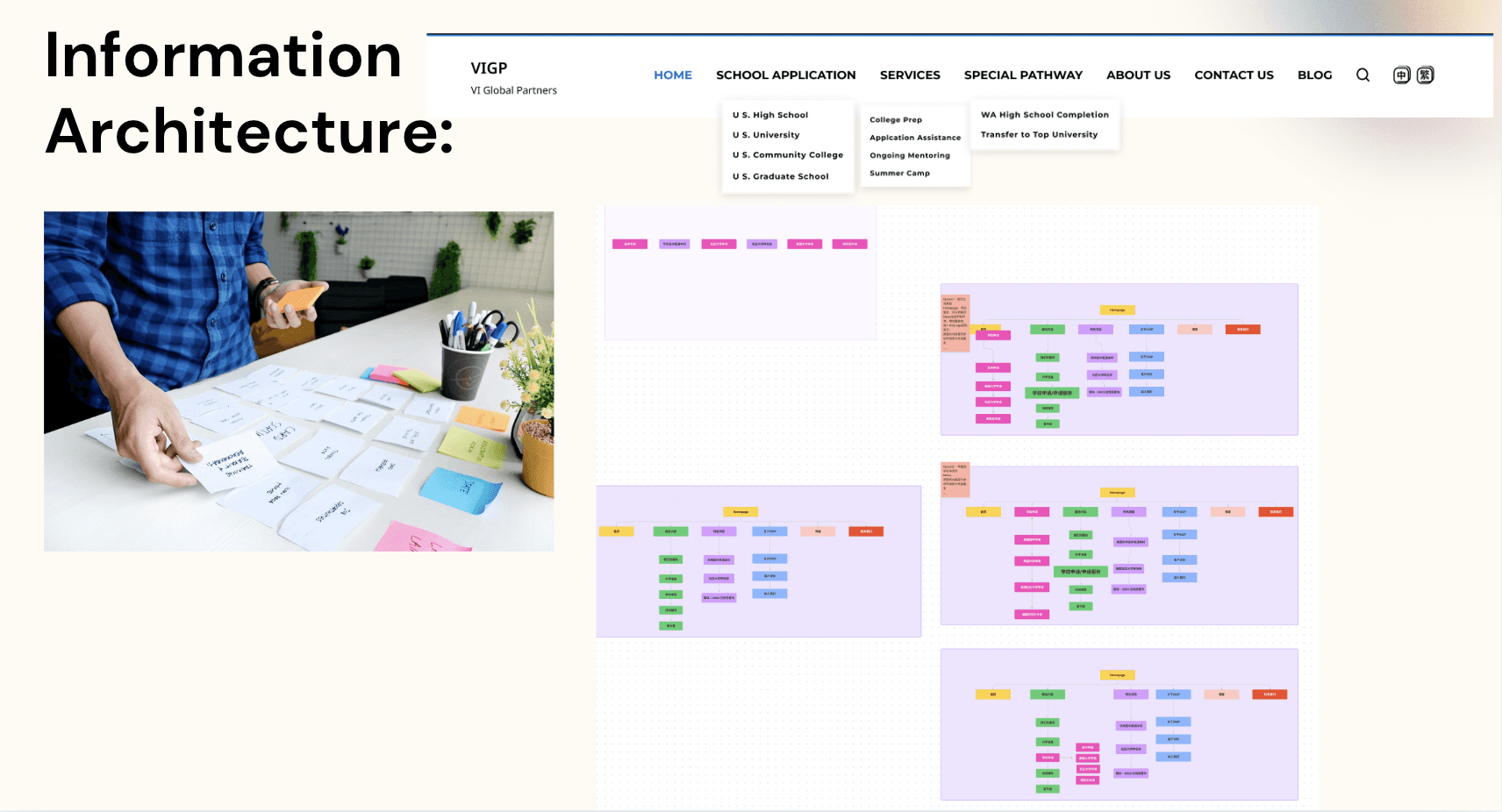
Information Architecture:
Reorganized the full site navigation and page hierarchy based on research findings. Designed tiered navigation covering School Application, Services, Special Pathway, and more — and restructured page content so the most decision-critical information appeared first.
Design:
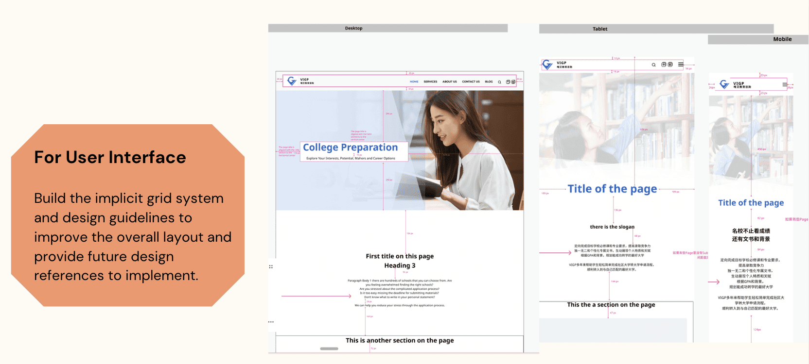
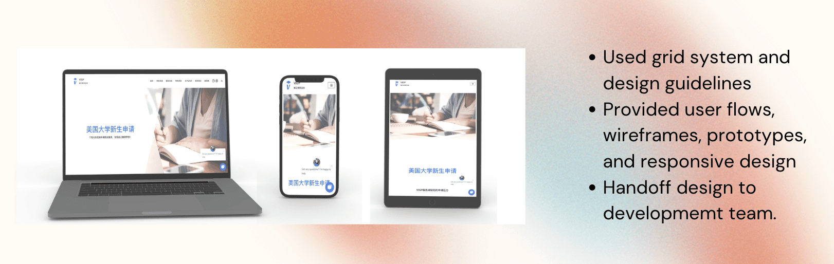
Built an implicit grid system and design guidelines to create consistency across all pages and support responsive design across desktop, tablet, and mobile.
Designed user flows, wireframes, and interactive prototypes.
Developed tailored service plan pages (Core / Pro / Basic) to address different user groups.
Simplified the school application process into a visual step-by-step timeline.
Added a robust FAQ section based directly on user survey findings.
Handed off to the development team and led QA.
Testing:
Ran 3 rounds of internal prototype testing with the team, followed by user testing sessions. Iterated based on feedback before final launch. Delivered three distinct application flows: 4-year University, Graduate School, and Community College.
Outcomes:
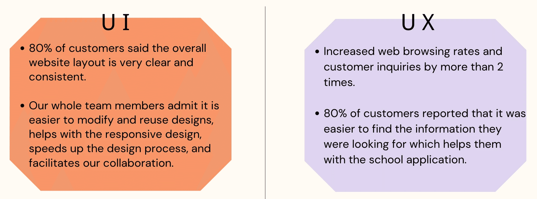
UI: 80% of users rated the redesigned layout as clear and consistent. The design system made it easier for the team to modify, reuse, and scale designs — speeding up the overall process.
UX: Web browsing rates and customer inquiries increased by more than 2x. 80% of users reported finding information on their own, reducing reliance on customer service.
Reflection:
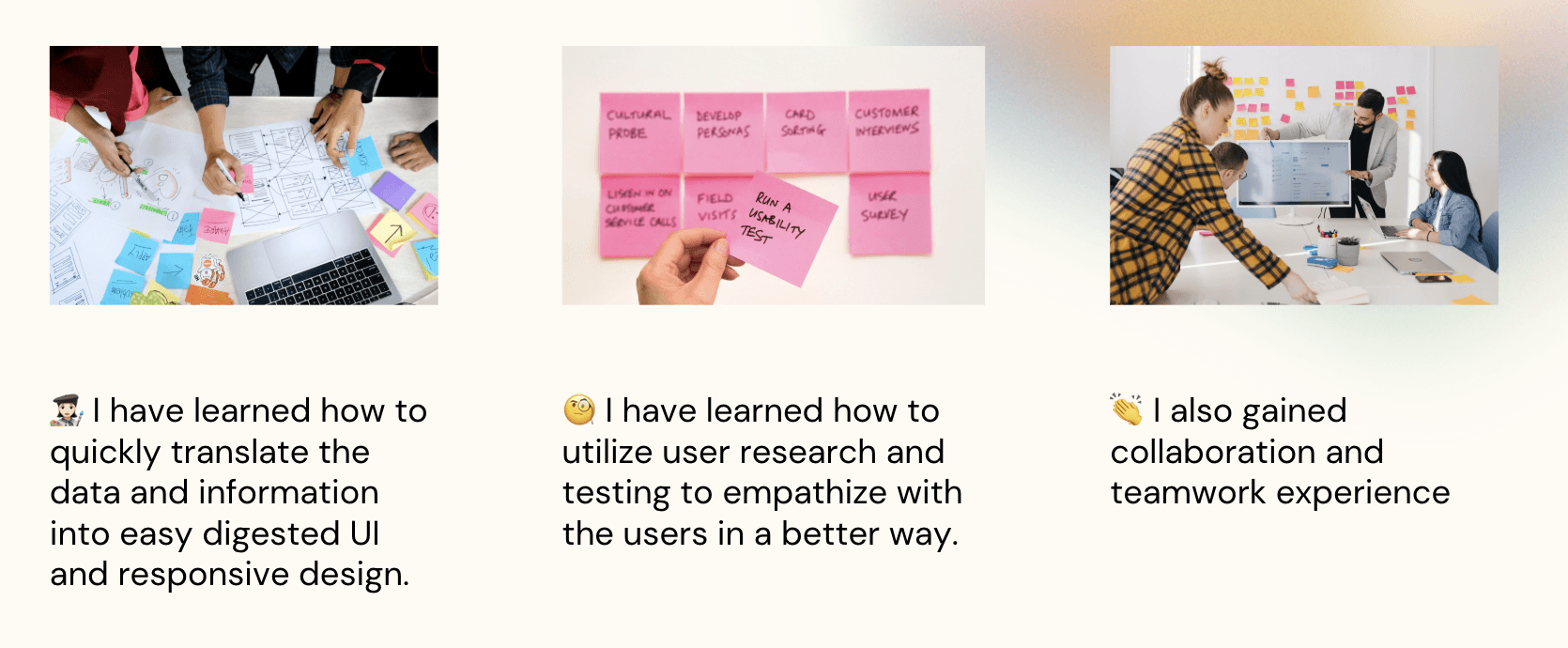
This project sharpened my ability to translate messy, complex information into structured, digestible UI. It also reinforced how much user research shapes better design decisions — the FAQ section and tiered service plans only existed because I listened to what users were actually confused about. And working cross-functionally with developers through handoff and QA gave me a stronger appreciation for designing with implementation in mind.
Other projects
Respondent Portal Redesign (Web + Mobile)
Mobile-First Panelist Experience
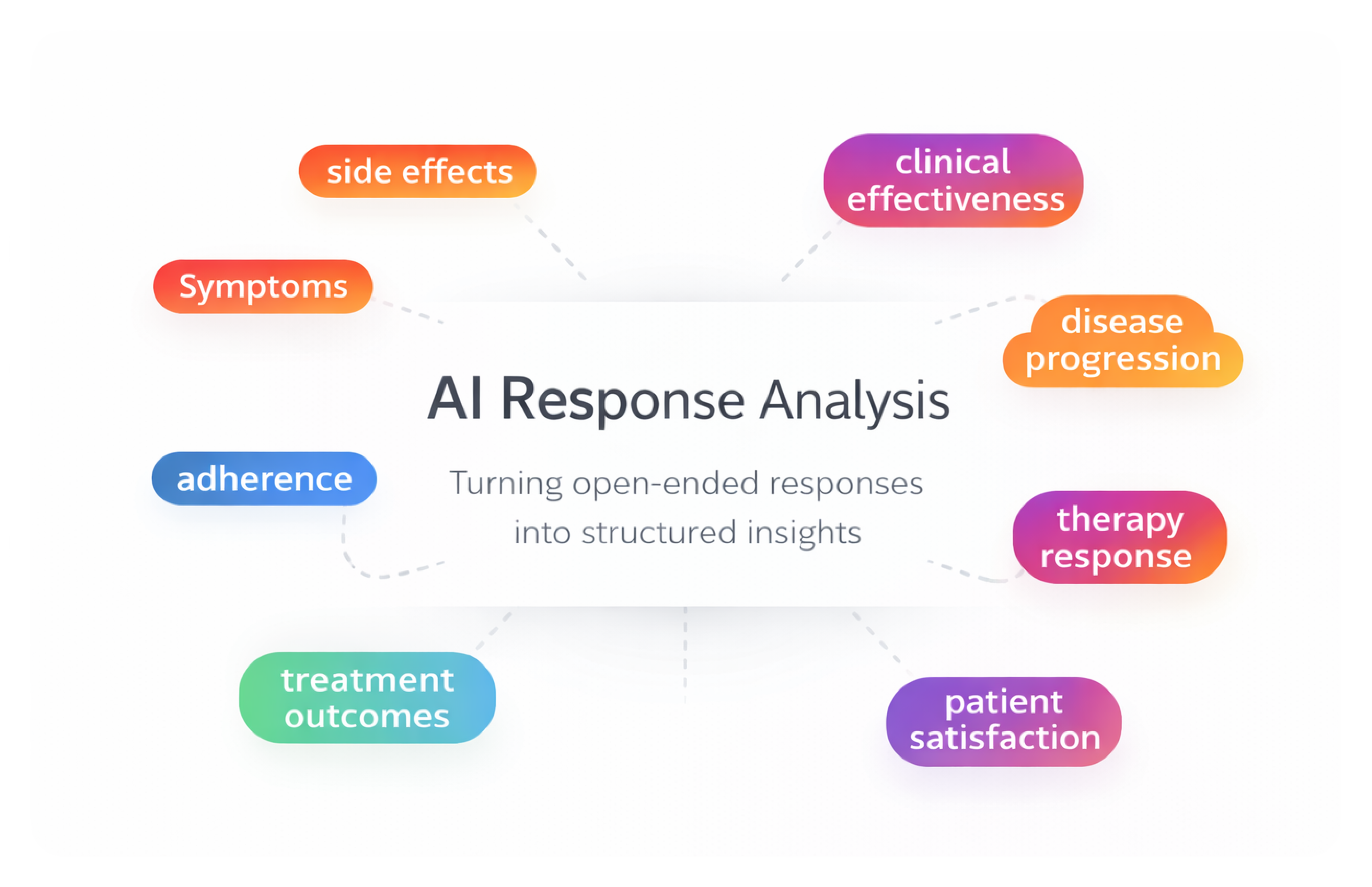
AI-Assisted Survey Response Analysis Tool
As a product designer on a 0-to-1 initiative, I designed an internal AI-assisted research tool that helps teams analyze and categorize large volumes of open-ended survey responses — enabling researchers to move from raw qualitative data to structured insights faster while maintaining transparency and human control.
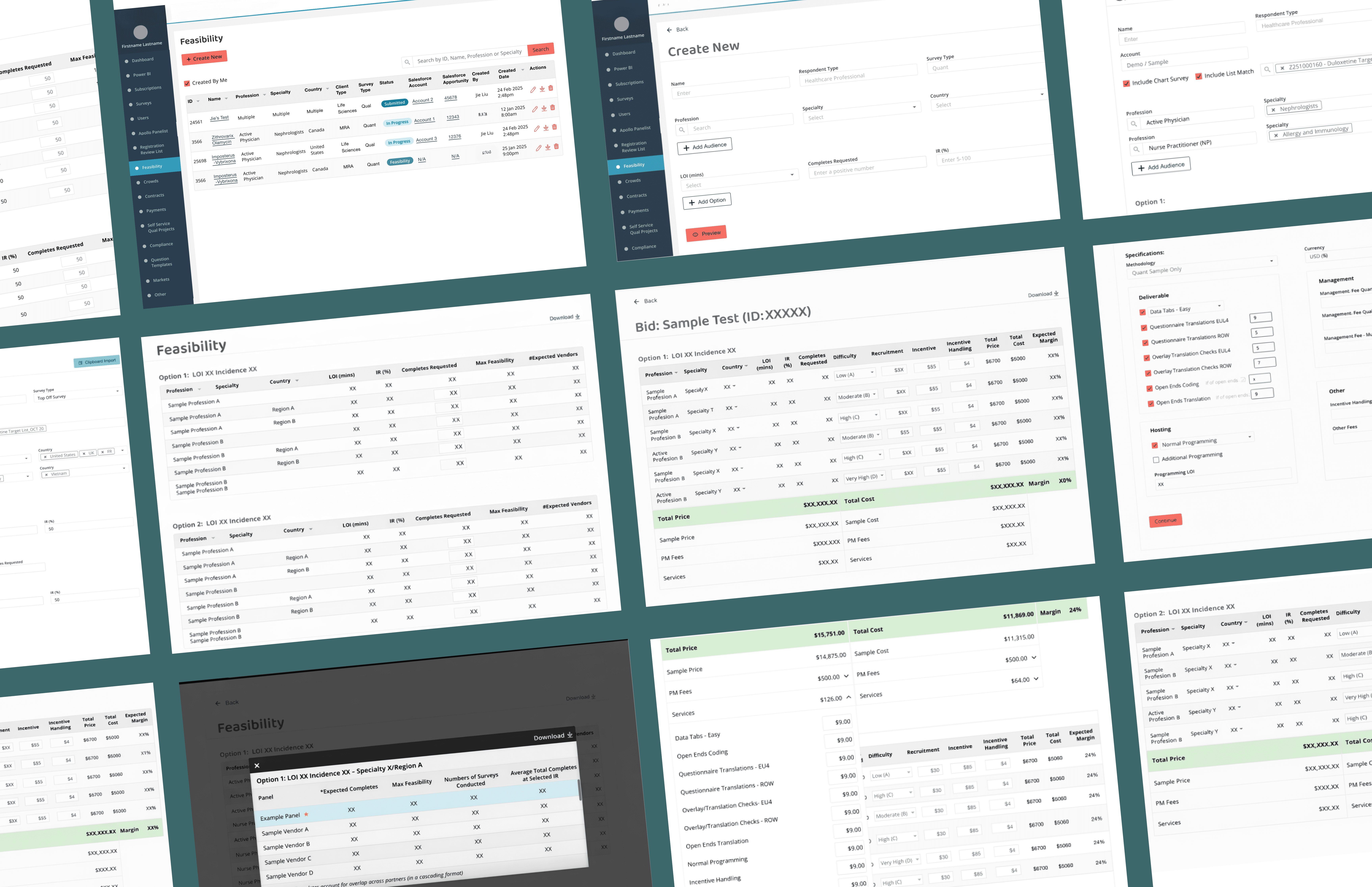
Feasibility & Pricing — Internal Decision Platform
As a product design lead on a zero-to-one project, designing a core internal platform that enables teams to evaluate whether a project is viable and how it should be priced— supporting confident decisions at scale.
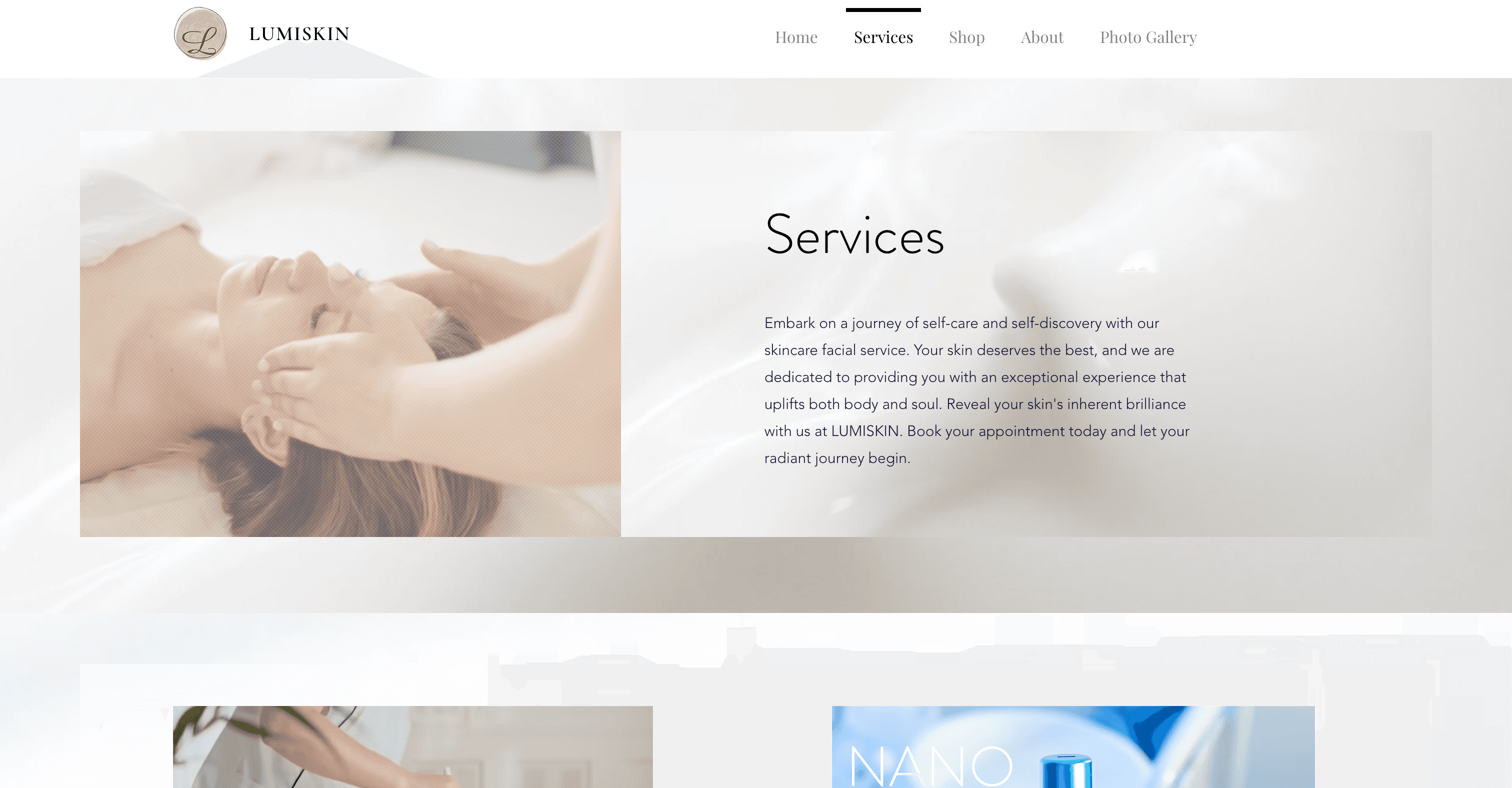
Beauty Spa Startup — Marketing Website
Designed and launched a booking website that helps users discover spa services, book appointments, and complete payments online.
