Respondent Portal Redesign (Web + Mobile)
Mobile-First Panelist Experience
Role
Product Designer
Industry
Healthcare Market Research
Duration
3 months (Discovery → Launch)
Overview:
The Respondent Portal is a core experience used by participants to discover surveys, track rewards, and manage their participation across web and mobile. Over time, the existing portal accumulated features without a clear information hierarchy, which led to confusion for respondents and limited engagement outcomes for the business.
The portal serves healthcare professionals (e.g., doctors and nurses) who predominantly use their phones in short bursts throughout the day to manage their accounts and complete surveys.
This project focused on redesigning the portal end-to-end, starting with a mobile-first approach to establish clarity, scalability, and alignment across platforms.
Problem — User Pain Points & Stakeholder Goals
Respondents struggled with foundational tasks, while business stakeholders were focused on engagement and retention outcomes.
Respondent Pain Points:
Feedback from respondents and support teams highlighted several recurring issues:
Users struggled to find basic reward information, including current balance, reward history, and payment status
Navigation felt cluttered and unpredictable, making it hard to know where to go next
On mobile, important actions were often buried due to limited screen space
Business & Stakeholder Goals:
Internal stakeholders had clear but competing objectives:
Increase respondent registrations
Reduce opt-out rates
Promote survey completion
Encourage repeat participation by making rewards more visible and motivating
The challenge was not a lack of features, but an overwhelming amount of information presented without clear prioritization.
Design Challenge:
The core challenge was balancing clarity and engagement within a complex system while supporting both web and mobile experiences. The portal needed to communicate essential information quickly—especially during short, fragmented usage sessions on mobile—without oversimplifying workflows or hiding important details.
The experience needed to surface critical information in seconds—especially on mobile—without overwhelming respondents or obscuring key actions.
Key Insights:
Through respondent interviews, support tickets, and stakeholder input, I learned that the majority of respondents were healthcare professionals, such as doctors and nurses. They typically logged into the portal on their phones during short, fragmented moments throughout the day.
In these moments, respondents were primarily interested in a small set of questions:
Which surveys are available right now?
What is the topic?
How long will it take to complete?
How much reward can I earn?
I realized the root problem wasn’t missing functionality, but unclear information hierarchy. If these answers were not immediately visible—especially on mobile—users disengaged. Designing for the smallest screen became the most effective way to force prioritization and reduce cognitive load.
Design Strategy
Mobile-First Approach
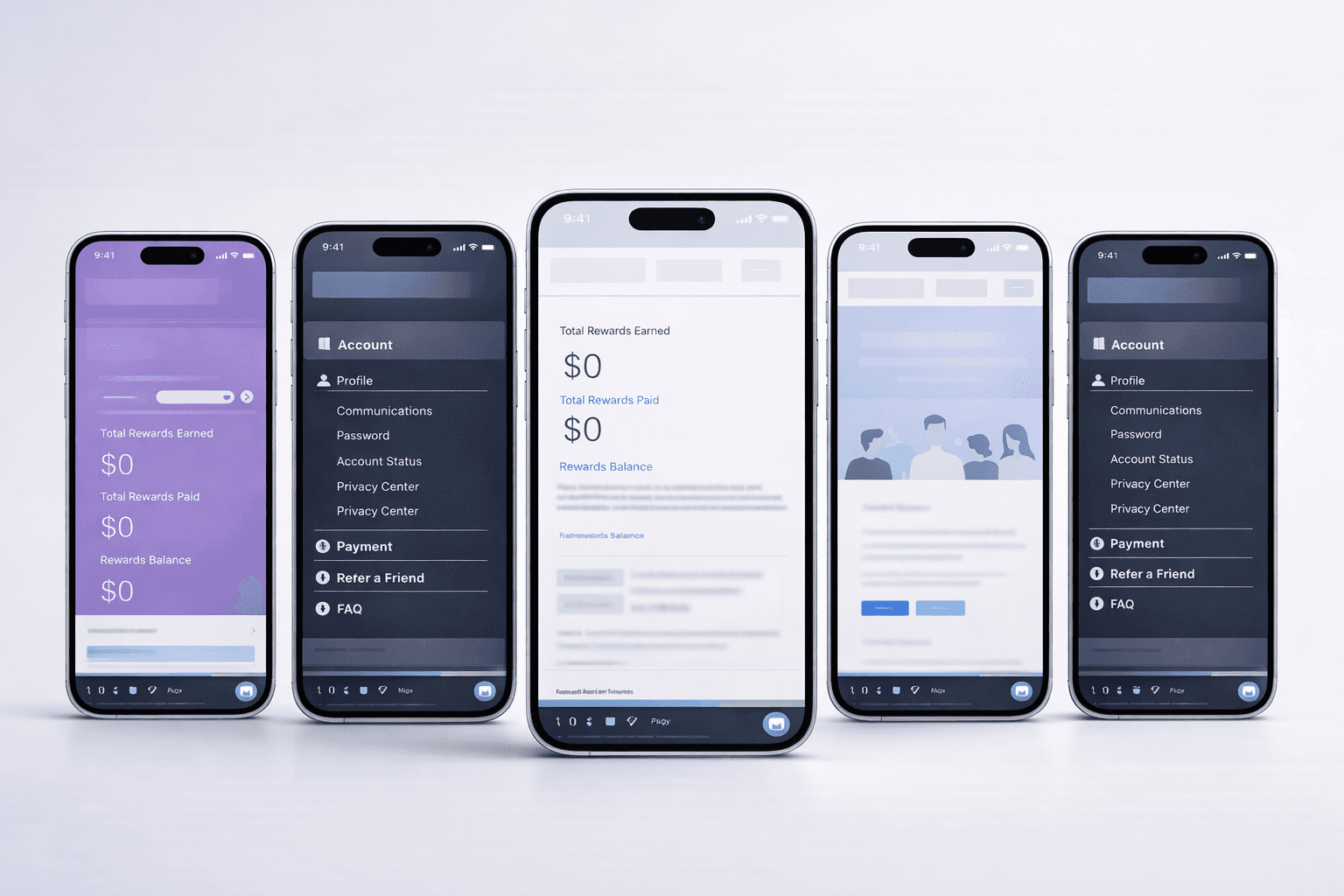
I chose to lead the redesign with a mobile-first strategy. Designing within tight constraints helped define a clear hierarchy of information and actions. Once the experience worked well on mobile, it could be extended thoughtfully to desktop without reintroducing clutter.
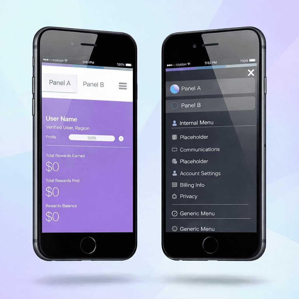
Information Architecture
The portal was reorganized around three primary areas:
Survey Discovery – clearly surfaced available and in-progress surveys with a single primary action
Rewards – made current balance, reward history, and payment status easy to find
Account & Secondary Information – deferred or layered through progressive disclosure
Navigation was simplified to reduce decision fatigue and help users quickly understand where they were and what they could do.
Interaction Design
To support common respondent behaviors, I focused on:
Clear visual hierarchy and concise labels
Strong primary actions per state to reduce hesitation
Consistent patterns across web and mobile to build familiarity
These decisions ensured users could act quickly without needing to interpret complex UI patterns.
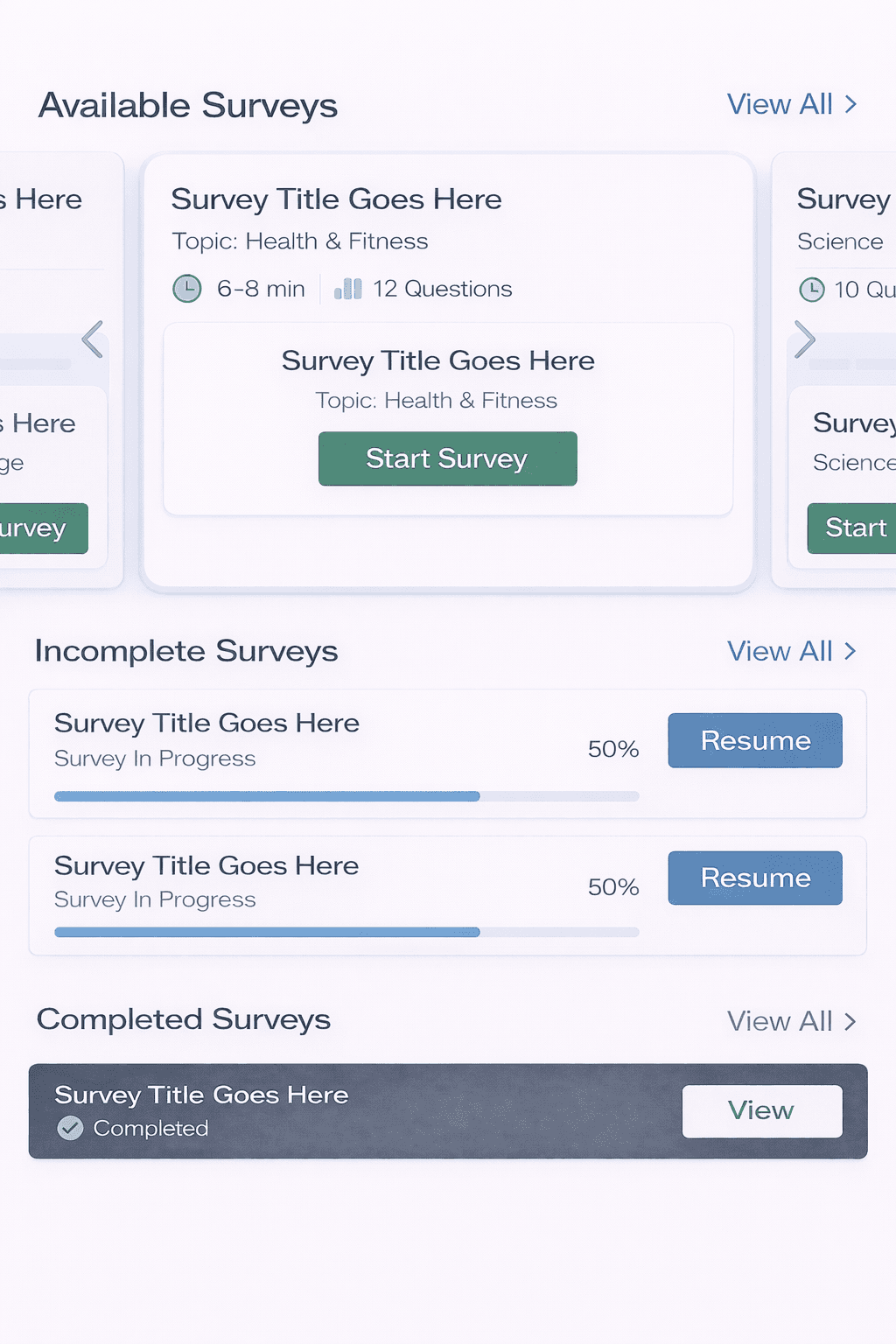
To reduce decision friction and encourage faster survey starts, I redesigned the Available Surveys section as a dedicated, mobile-friendly carousel that highlights only new and available surveys.
Each survey is presented as an individual card with essential context—topic, estimated time, and number of questions—allowing respondents to quickly assess whether a survey fits their availability. Rather than overloading the interface with secondary navigation or pagination indicators, the carousel relies on natural horizontal scrolling to signal that multiple surveys are available.
The “Start Survey” call-to-action is placed prominently at the center of each card, making the primary action immediately visible and reducing hesitation at the moment of decision. By keeping actions scoped to the card level and removing pagination dots, the design avoids confusion between survey selection and survey progress, while maintaining a clear and focused entry point.
This approach helps respondents quickly choose and start a survey during short, time-constrained sessions—especially on mobile—supporting higher engagement and smoother transitions from discovery to completion.
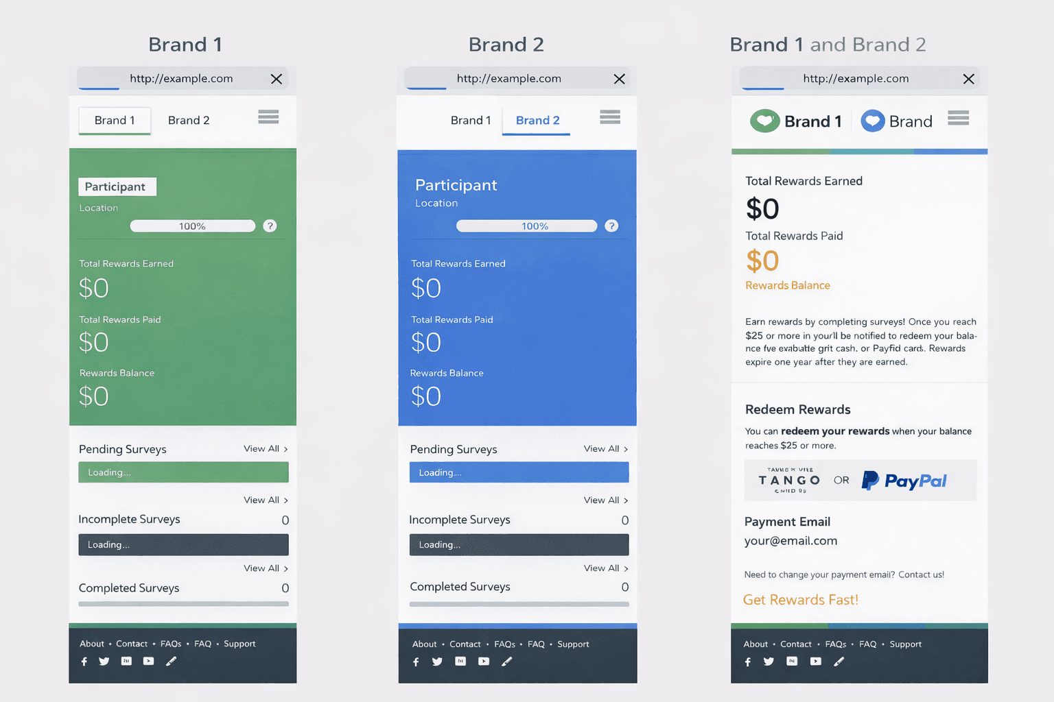
Rewards Transparency as Motivation
To encourage continued participation, rewards and points were made more visible throughout the experience.
By clearly communicating earnings and progress at a glance, the design reinforces trust and motivates users to return, reducing uncertainty around incentives.
Supporting Decisions
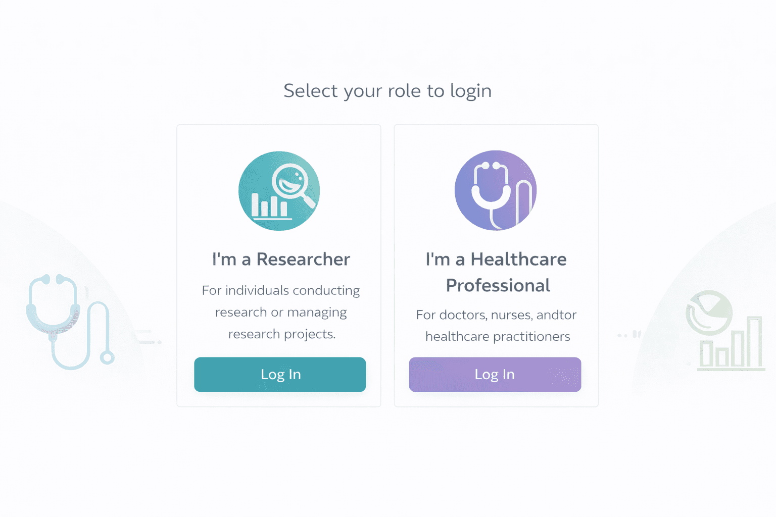
Streamlined Login for Returning Users. This flow is live and used by active panelists. The experience distinguishes between researcher and healthcare professional roles to reduce ambiguity at entry.
Efficient Search for Power Users
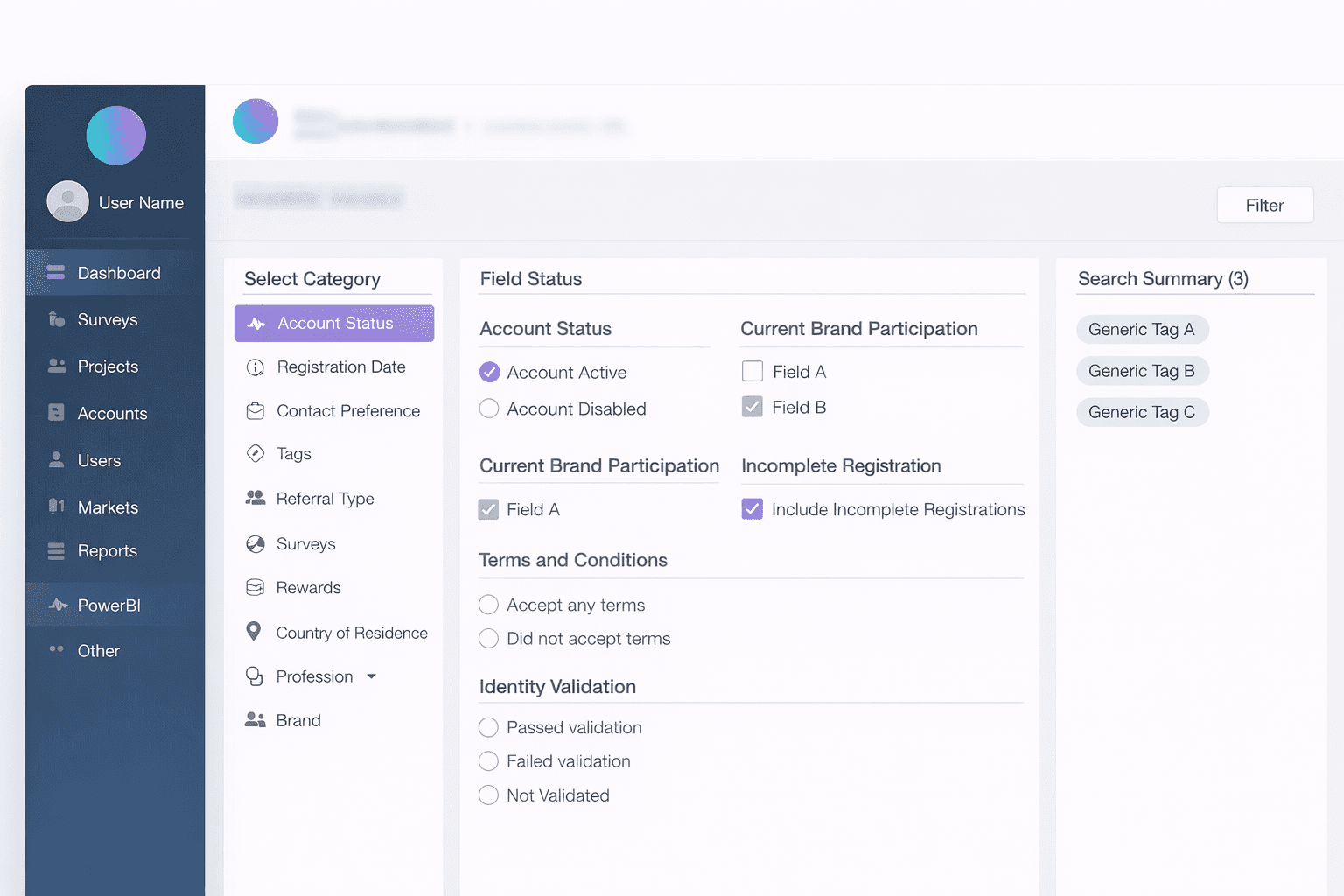
For high-frequency internal users managing large datasets, they will be directed to the new AUS page layout, featuring 3 columns.
The left column displays all tabs, the middle column showcases detailed selections, and the right column presents the search summary.
Users will instantly appear in the "Search Summary" on the right as they choose attributes.
Clicking the "Filter User" button will lead users to the main dashboard, displaying the filter tag and result table.
Collaboration
I worked closely with product managers to align on success metrics and prioritize business goals, and with engineers to validate feasibility and ensure designs scaled across platforms. I also collaborated with other designers to align patterns with the broader design system and reviewed work with stakeholders to align on trade-offs and direction.
📊Outcome / Impact
The redesign of the Respondent Dashboard significantly improved navigation clarity and mobile usability, resulting in stronger engagement across the portal after launch.
By taking a mobile-first approach and reducing friction across high-frequency tasks—such as survey discovery, reward visibility, and account management—panelists were able to more easily understand what actions were available to them. This clarity made it easier for users to re-engage with the platform during short, time-constrained sessions, a common usage pattern among healthcare research respondents.
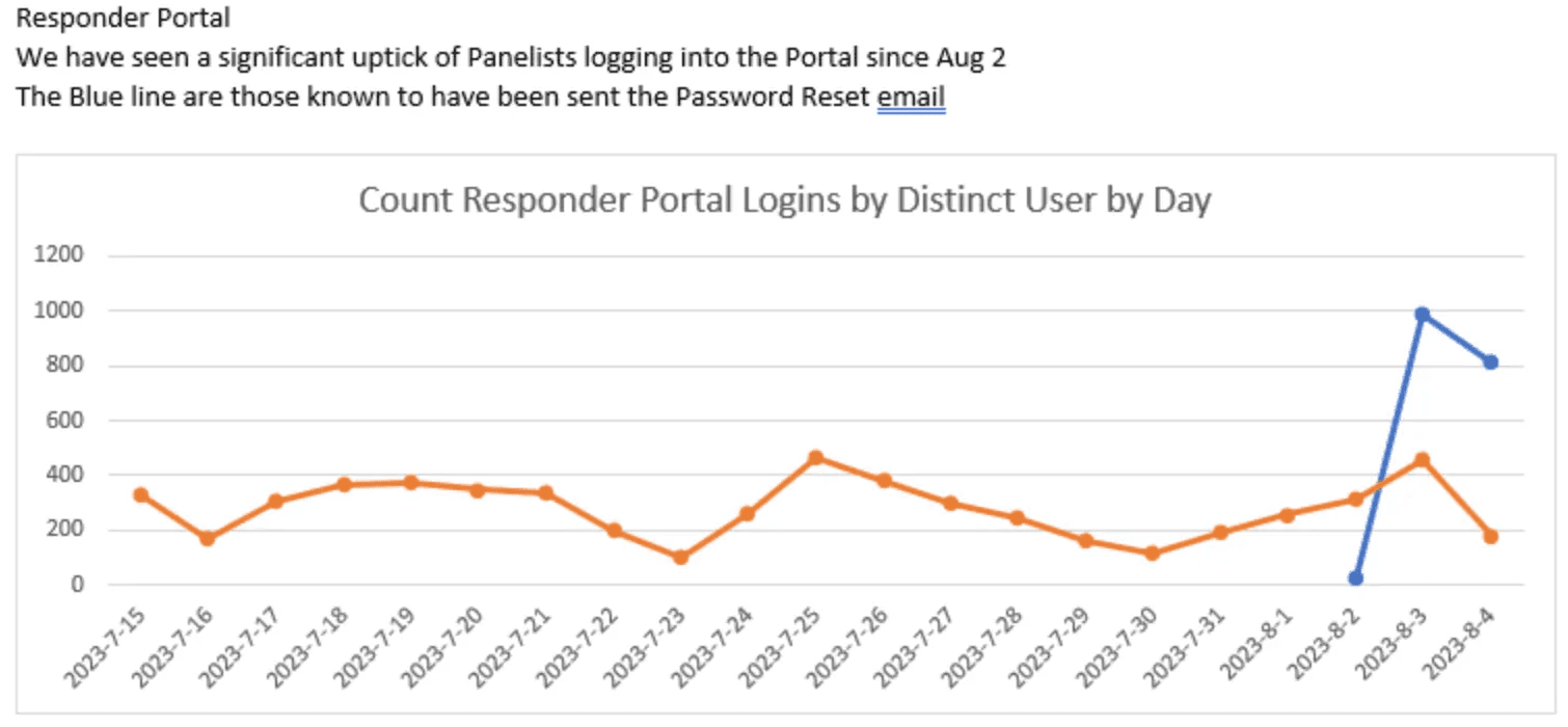
As a result, post-launch data showed a clear increase in panelist logins, particularly among users returning via account recovery and reminder emails (see chart). This suggests that clearer entry points, action visibility, and mobile-friendly flows lowered the barrier to re-entry and supported successful re-engagement.
Beyond individual user behavior, the redesigned dashboard also provided a scalable foundation for launching new fieldwork tools across multiple panel brands. The system successfully supported both single-brand and dual-brand panelist experiences, enabling consistent interactions and faster rollout at scale.
Recognition
This work contributed to the award-winning InCrowd Essentials platform, which received a 🏆 Bronze Stevie® Award for product innovation in the life sciences space.
The recognition highlighted the platform’s real-time reporting, actionable insights, and measurable impact on client outcomes—reflecting the broader value of building clear, scalable, and user-centered internal and user-facing tools.
Reflection / What I Learned
Designing the Respondent Dashboard reinforced how critical clarity and prioritization are when users interact with a product in short, fragmented moments.
I learned that mobile-first design is not simply about adapting layouts to smaller screens, but about making deliberate trade-offs—deciding what deserves immediate attention and what can be safely deferred. By prioritizing high-frequency actions and supporting complexity through progressive disclosure, the experience remained both efficient for users and scalable for the system.
This project also deepened my understanding of how transparency, particularly around rewards and progress, directly impacts trust and engagement in user-facing products. When users clearly understand where they stand and what they gain, they are more likely to return, participate, and complete tasks over time.
Overall, this work strengthened my approach to designing engagement surfaces—not as static dashboards, but as intentional entry points that guide behavior, reduce friction, and support long-term participation.
Other projects
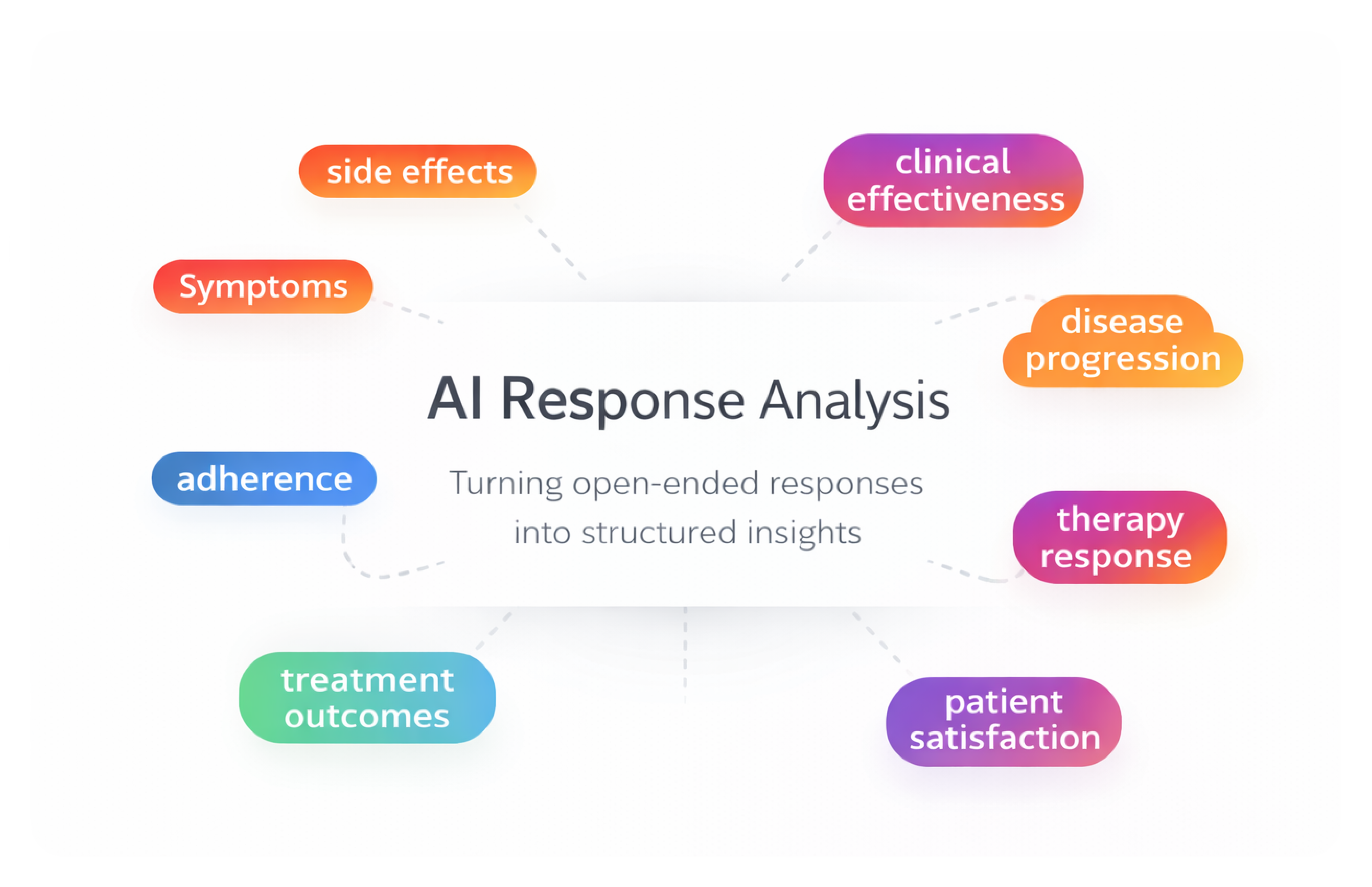
AI-Assisted Survey Response Analysis Tool
As a product designer on a 0-to-1 initiative, I designed an internal AI-assisted research tool that helps teams analyze and categorize large volumes of open-ended survey responses — enabling researchers to move from raw qualitative data to structured insights faster while maintaining transparency and human control.
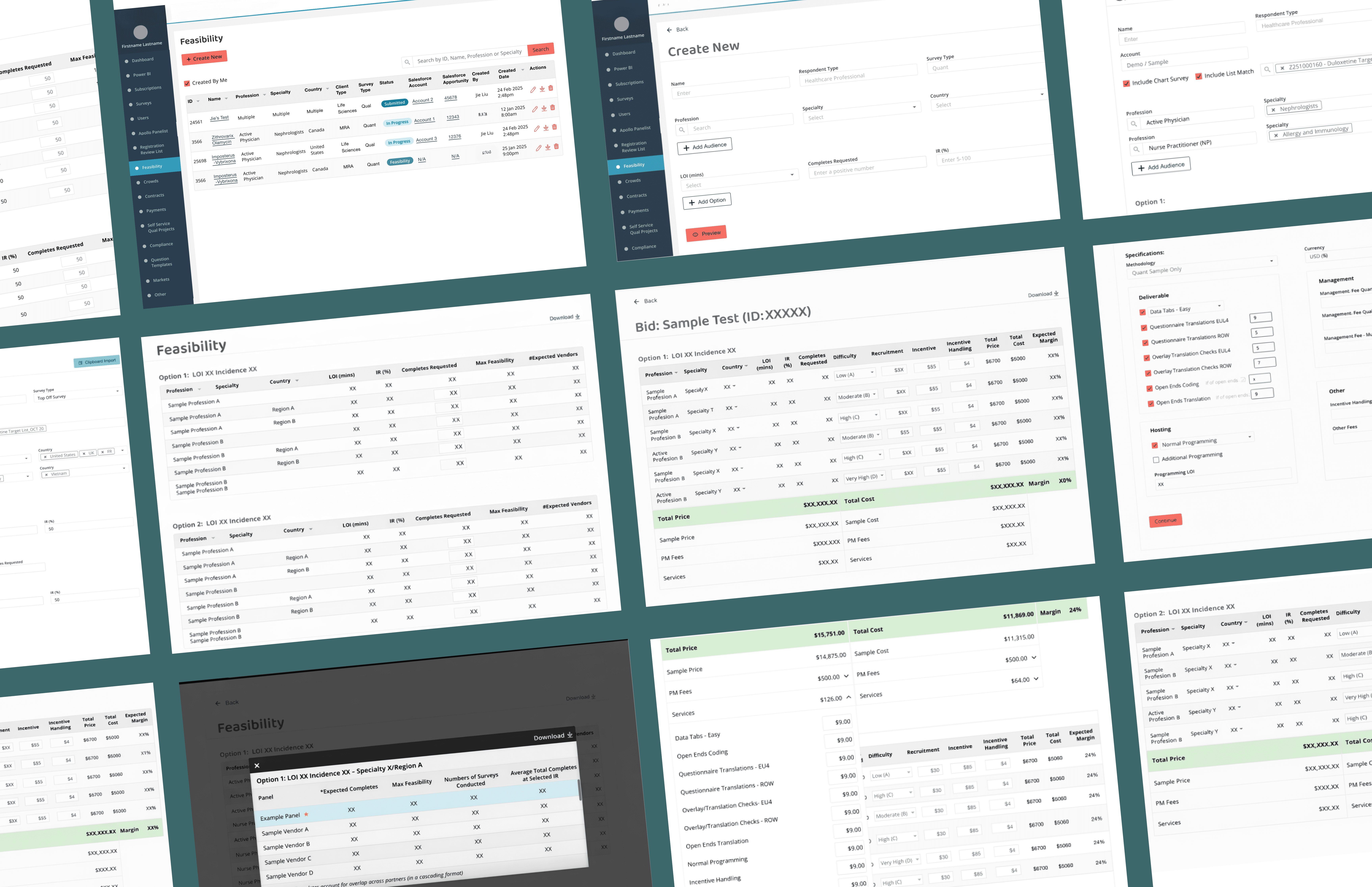
Feasibility & Pricing — Internal Decision Platform
As a product design lead on a zero-to-one project, designing a core internal platform that enables teams to evaluate whether a project is viable and how it should be priced— supporting confident decisions at scale.
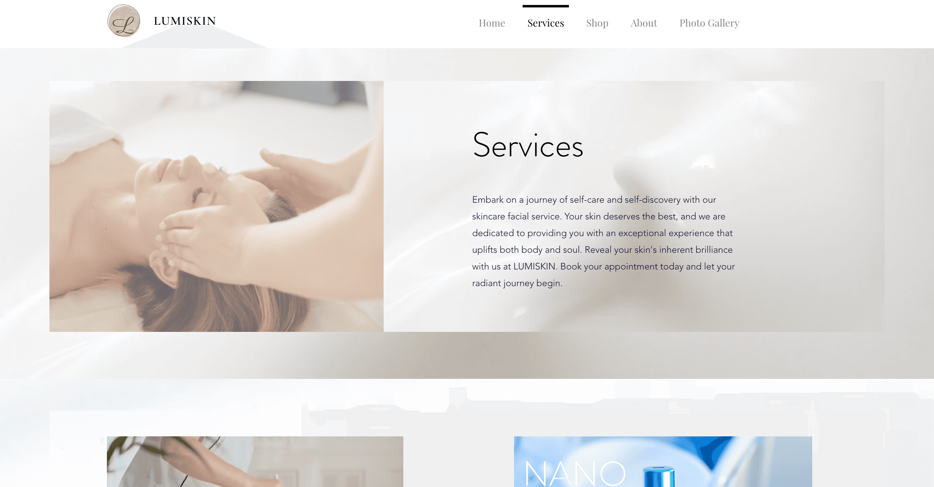
Beauty Spa Startup — Marketing Website
Designed and launched a booking website that helps users discover spa services, book appointments, and complete payments online.

Education Platform — University Application Support Website
Redesigned a university application support website for an international education consultancy, restructuring the information architecture and visual design to help prospective students quickly understand services and take action — resulting in 2x more inquiries and 80% of users reporting improved findability.
