Beauty Spa Startup — Marketing Website
Designed and launched a booking website that helps users discover spa services, book appointments, and complete payments online.
Role
UXUI Designer
Industry
Beauty / Wellness
Duration
3 months
Overview
LUMISKIN is a beauty spa startup founded by a solo entrepreneur. Before the website launched, the business had no digital presence — all service information was communicated manually, and bookings were handled offline. The founder needed a way to establish her brand online and convert first-time visitors into paying customers with minimal friction.
Problem:
Without a digital platform, potential customers had no way to discover services, compare options, or book on their own. This created a bottleneck for the business and made it hard to scale beyond word-of-mouth.
Research:
I started by working closely with the founder to understand her business goals, target audience, and brand vision. Through our conversations, a few key insights shaped the direction:
Her clients ranged from skincare enthusiasts to complete novices — the site needed to educate, not just sell
Trust and aesthetics were critical; the brand needed to feel premium and calm before a customer would commit to booking
The booking process had to be simple enough to complete without any assistance
I also reviewed how comparable spa and wellness businesses presented their services online, identifying common patterns and gaps — particularly around how services were described and how easily users could move from discovery to booking.
My Role:
I was the sole designer on this project, working directly with the founder from concept to launch. My responsibilities included defining the information architecture, designing the end-to-end service discovery and booking flow, building the visual system to reflect the brand's clean and calming aesthetic, and collaborating with development to ensure a smooth handoff.
Design Goals:
Help first-time visitors quickly understand what services are offered
Build trust through visual consistency and a calm, premium aesthetic
Make the booking process straightforward enough to complete without assistance
Design Process:
The design process focused on structuring information first, then translating it into a clear and intuitive interface:
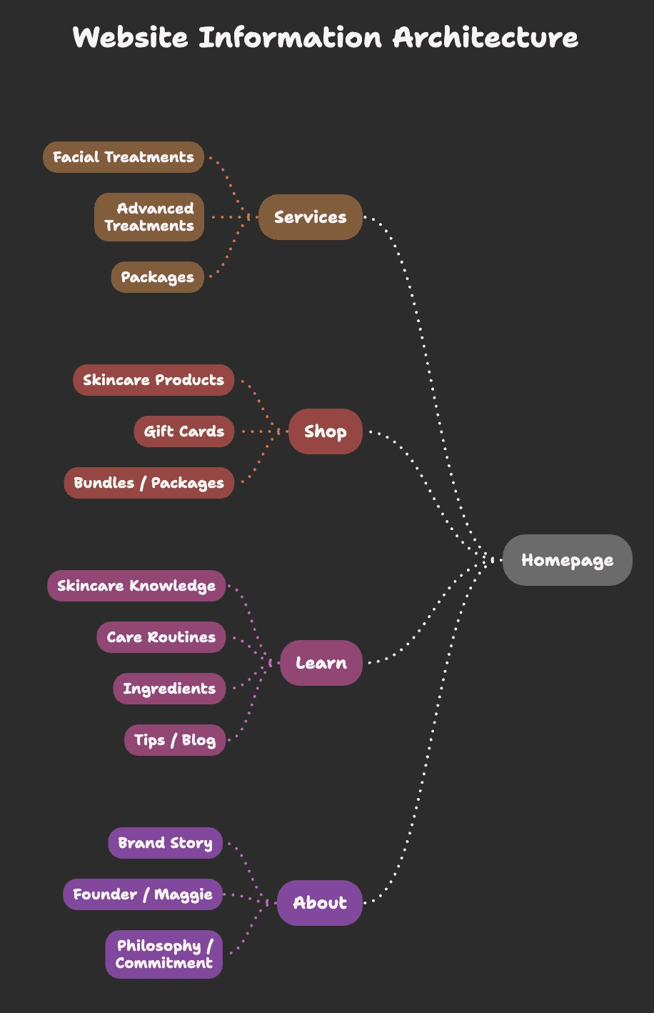
Structuring the Service Experience:
Since there was no existing structure, I first defined how services should be organized.
I introduced a consistent model where each service includes:
Clear naming
Key benefits
Duration
Pricing
This allowed users to easily scan and compare options without needing to read everything in detail.
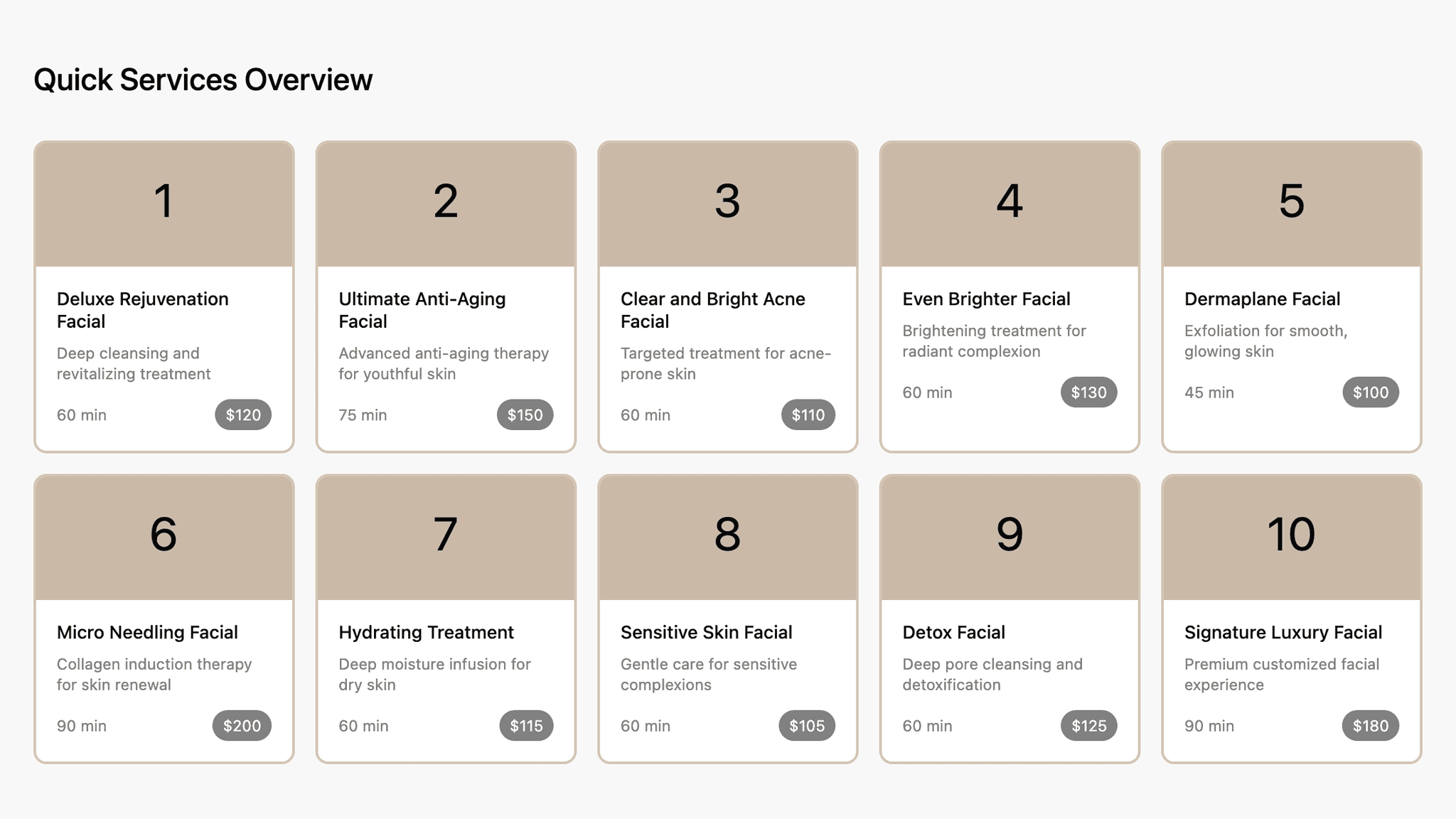
Designing the Interface:
The interface was designed to support quick scanning and visual clarity.
Services are presented in a grid layout for easy comparison
Visual hierarchy emphasizes key information
Consistent card patterns improve usability and recognition
The website is launched, you can view it here: View live website
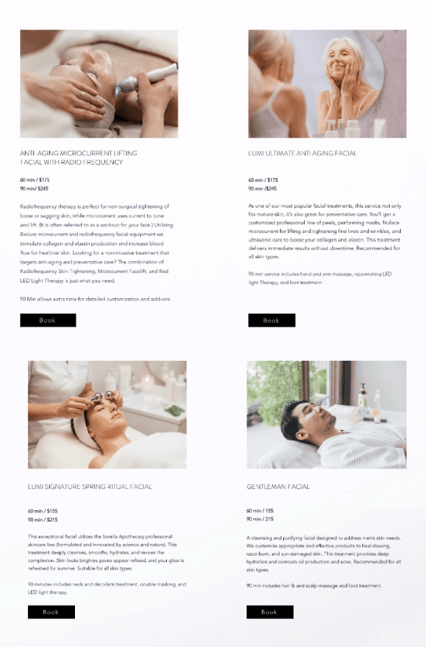
Supporting Decision-Making:
To support decision-making:
Key details (price, duration, type) are surfaced upfront
Descriptions are concise and easy to understand
Visual cues help users quickly differentiate between services
This reduces uncertainty and helps users choose with confidence
Booking Flow
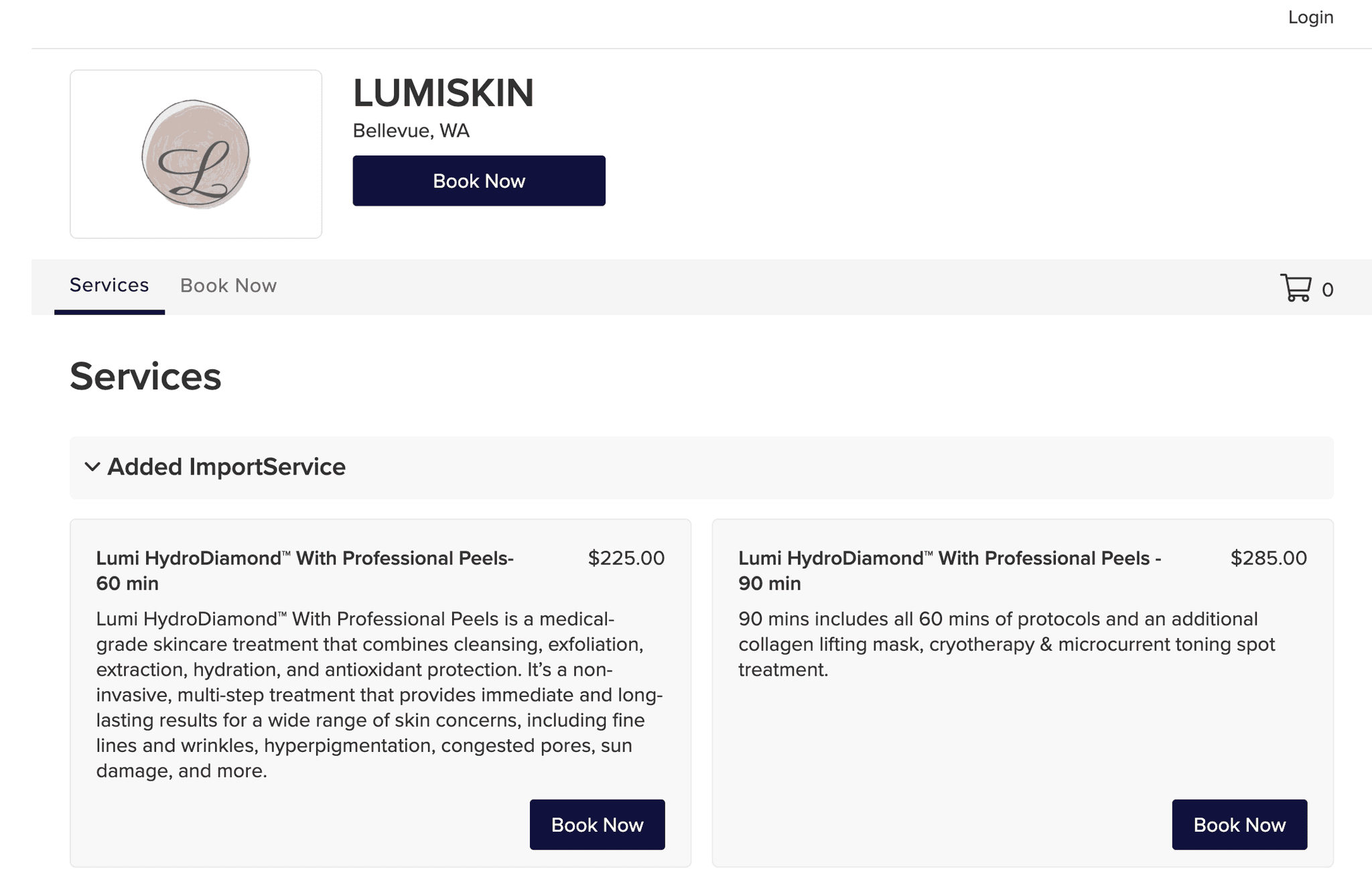
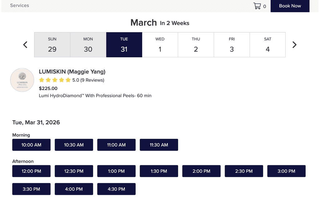
The booking experience was designed to be simple and guided.
Clear call-to-action from each service
Minimal steps to complete the booking
Reduced friction between browsing and scheduling
The goal was to create a seamless transition from interest to action.
Outcome
The site launched in 2022 and has been running for 3 years. Since launch, all customer bookings come exclusively through the website — the founder no longer handles any bookings manually. The business sees appointments nearly every day and has built a strong base of returning customers. Clients consistently describe the site as beautiful, on-brand, and easy to navigate.
The final website reduced manual scheduling, improved clarity around services and pricing, and provided a scalable foundation for future marketing efforts.
Other projects
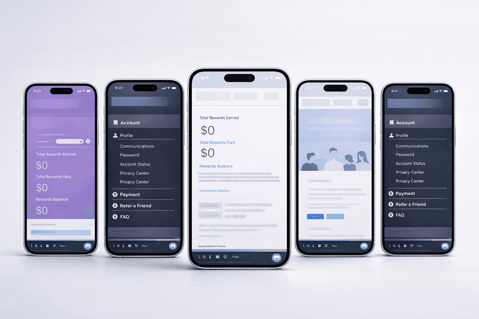
Respondent Portal Redesign (Web + Mobile)
Mobile-First Panelist Experience
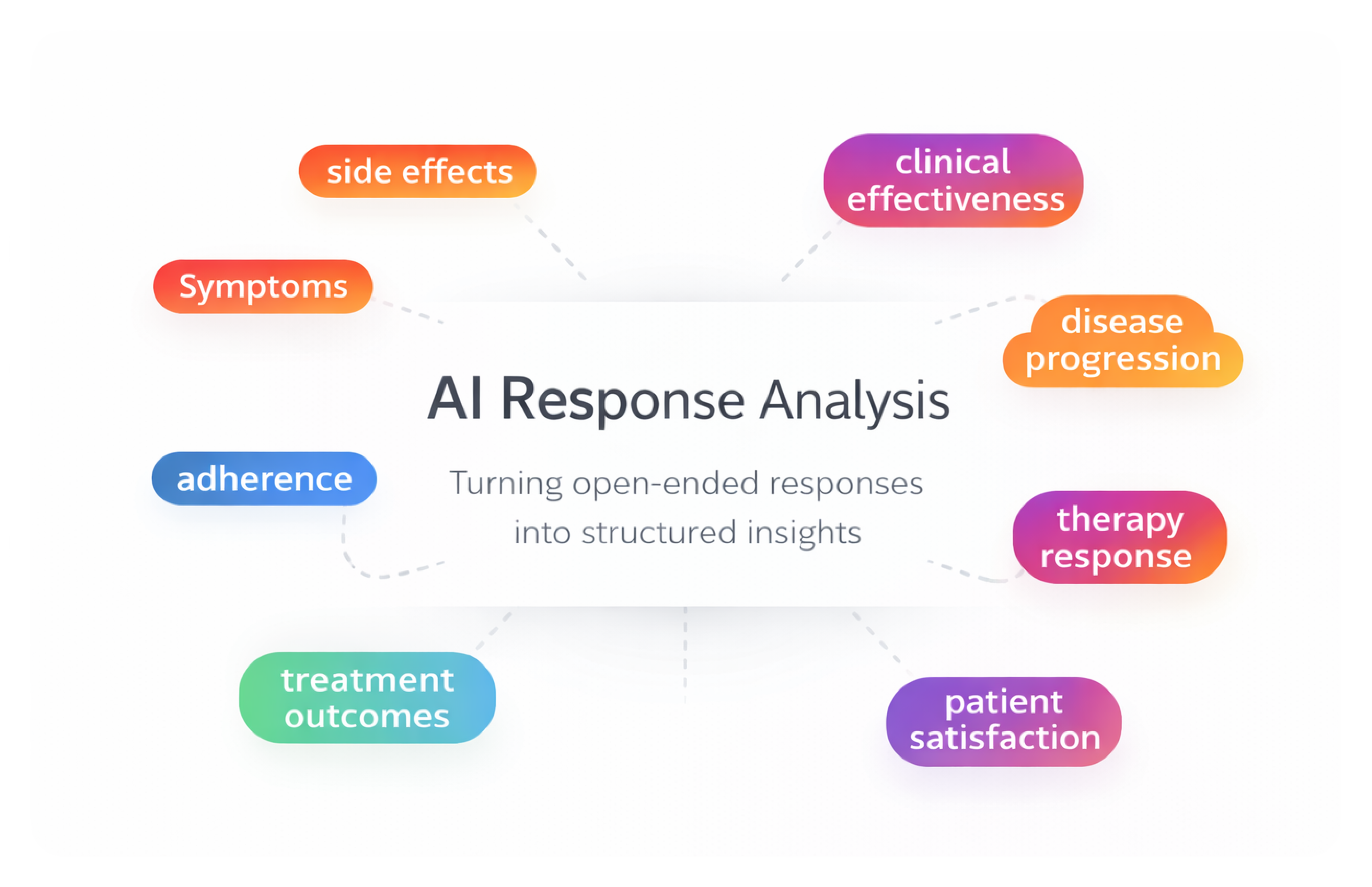
AI-Assisted Survey Response Analysis Tool
As a product designer on a 0-to-1 initiative, I designed an internal AI-assisted research tool that helps teams analyze and categorize large volumes of open-ended survey responses — enabling researchers to move from raw qualitative data to structured insights faster while maintaining transparency and human control.
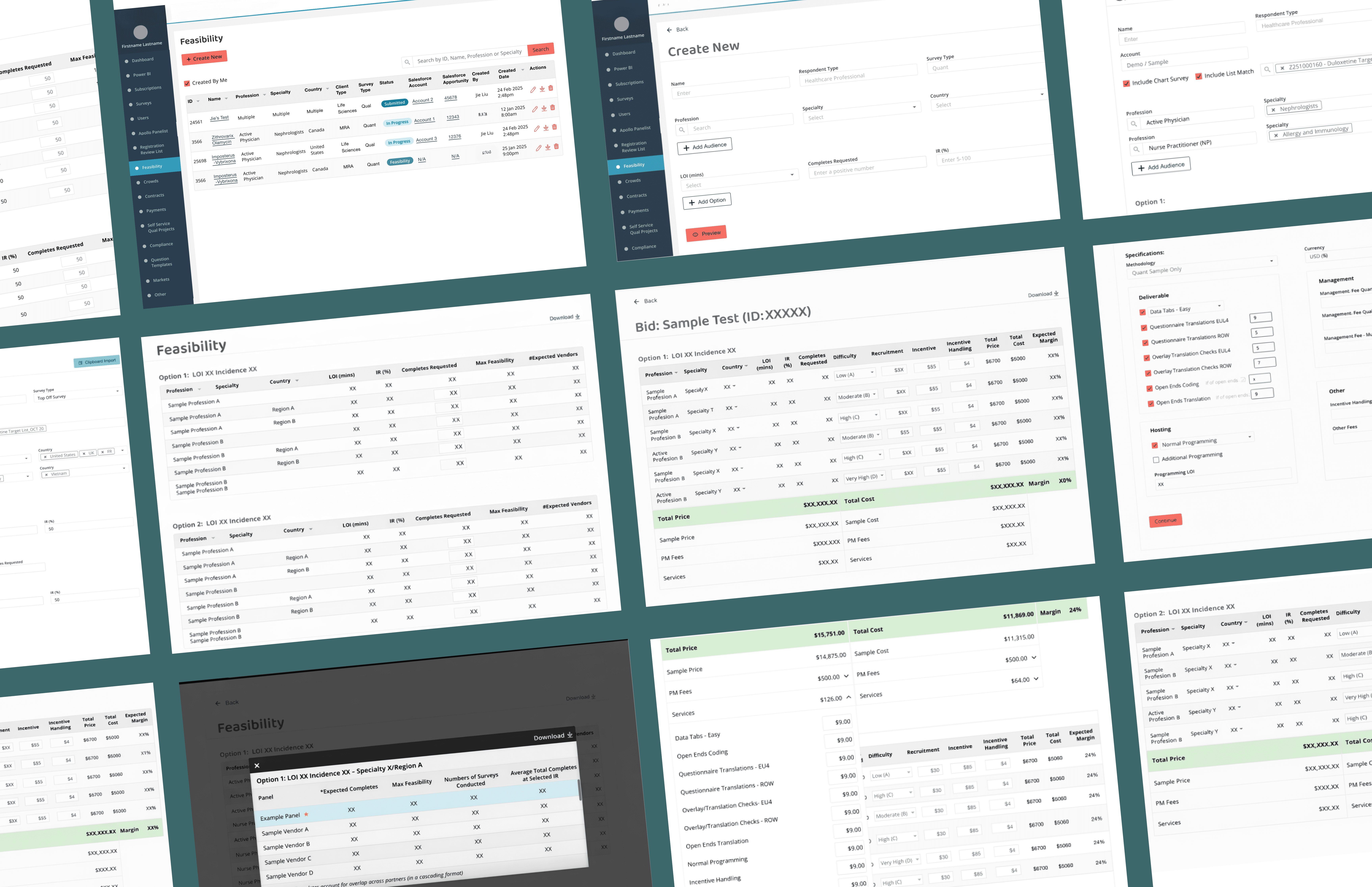
Feasibility & Pricing — Internal Decision Platform
As a product design lead on a zero-to-one project, designing a core internal platform that enables teams to evaluate whether a project is viable and how it should be priced— supporting confident decisions at scale.
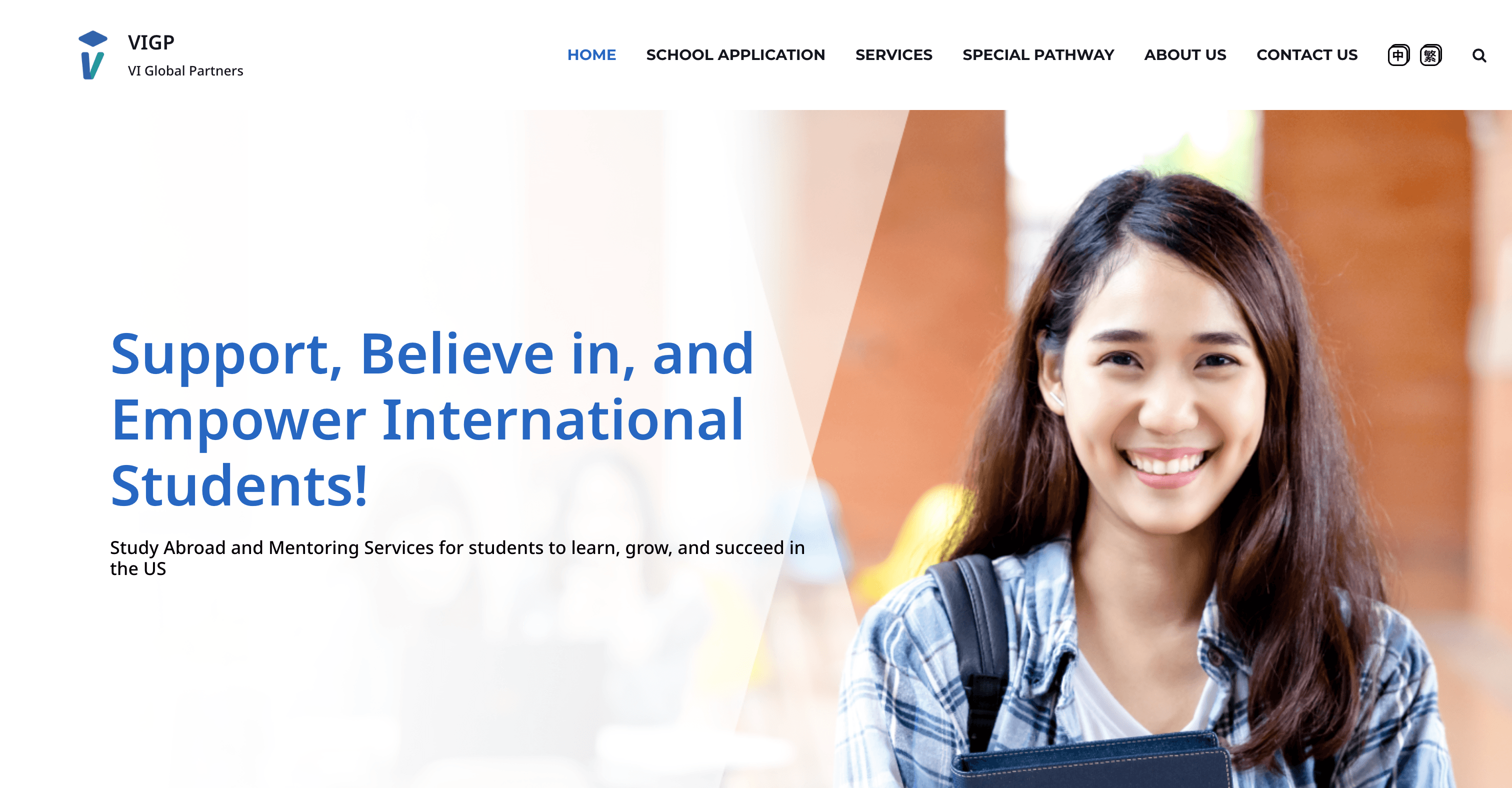
Education Platform — University Application Support Website
Redesigned a university application support website for an international education consultancy, restructuring the information architecture and visual design to help prospective students quickly understand services and take action — resulting in 2x more inquiries and 80% of users reporting improved findability.
