Education Platform
— University Application Support
An end-to-end redesign for an organization helping international students apply to U.S. universities — turning an outdated, confusing site into a structured journey across web and mobile that doubled qualified inquiries.
Problem
A site that buried
the very thing students came for.
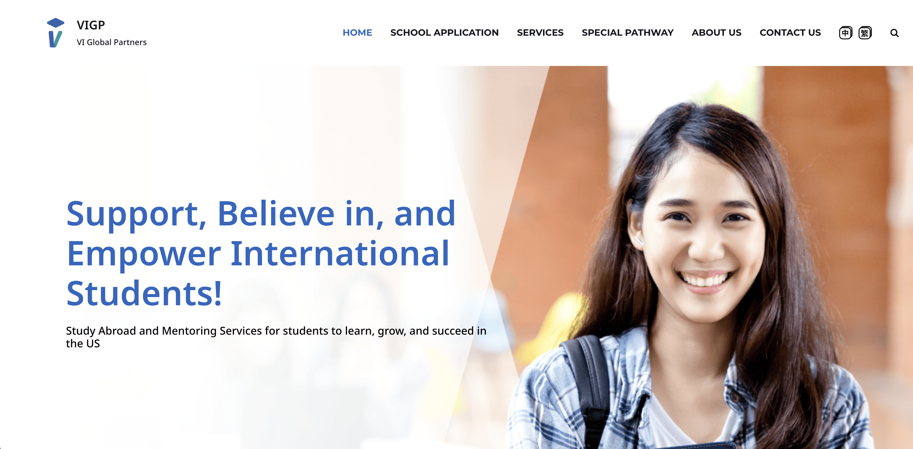
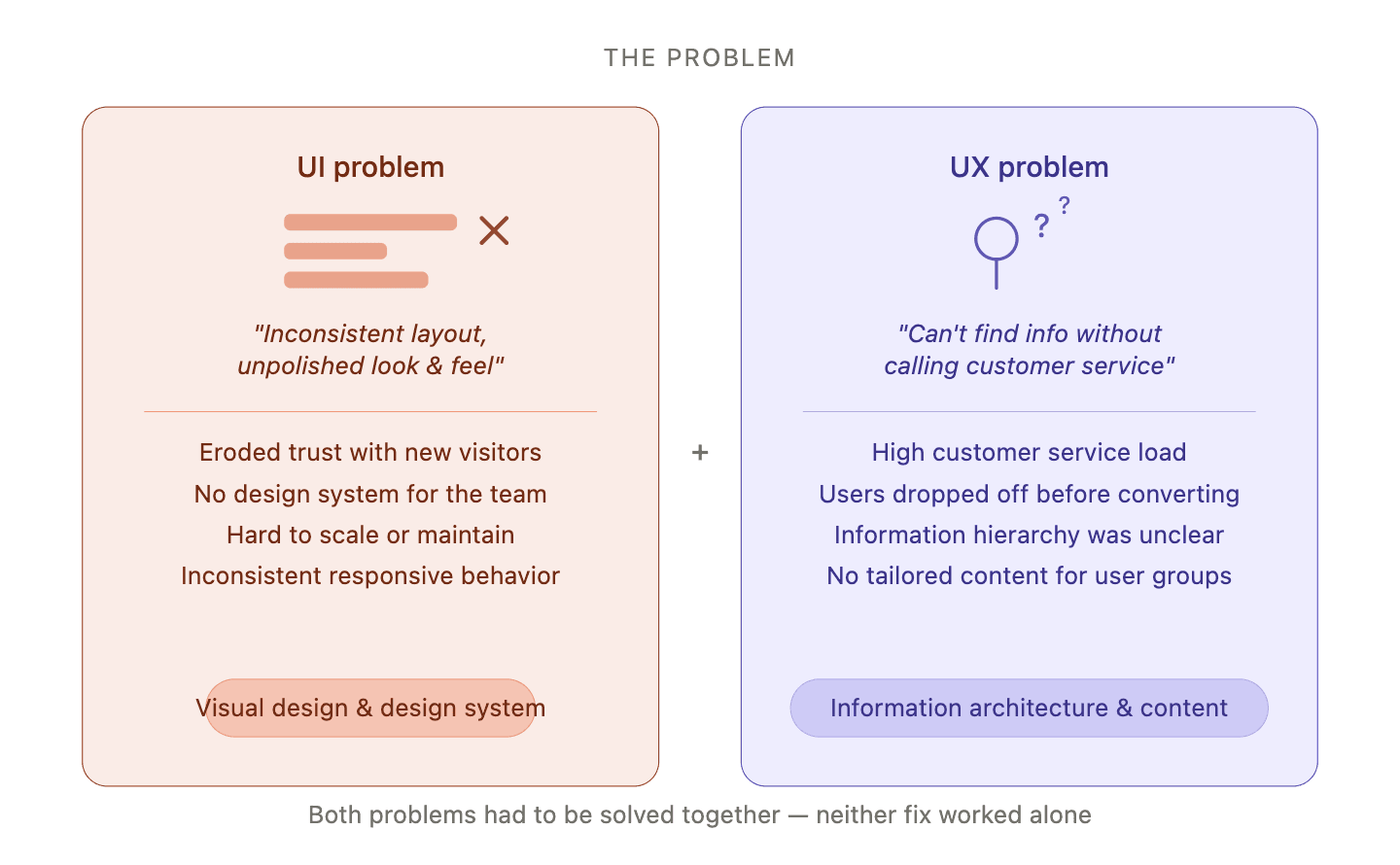
The existing platform was visually outdated and structurally unclear. Information was scattered across long pages, key services were hard to find, and users — most of whom were applying to U.S. universities for the first time — couldn't tell which programs fit their goals.
The business needed more qualified inquiries; students needed a path through unfamiliar territory. Both depended on a clearer, more trustworthy first impression.
Role
End-to-end designer focuses on UXUI.
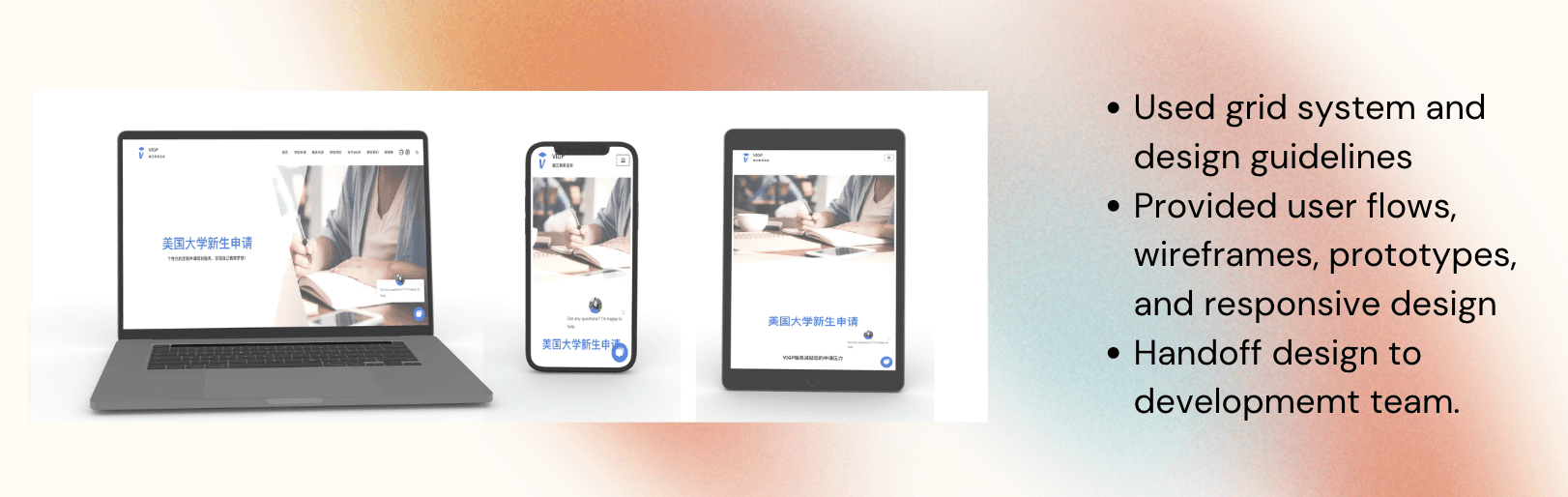
I led design from initial research through launch — discovery interviews with students and counselors, information architecture, visual design system, marketing-site implementation, and a companion mobile app for ongoing engagement after the inquiry.
My remit covered both surfaces: the marketing site as the moment of decision, and the mobile app as the place where the relationship continued.
Methods
Listening before redesigning.
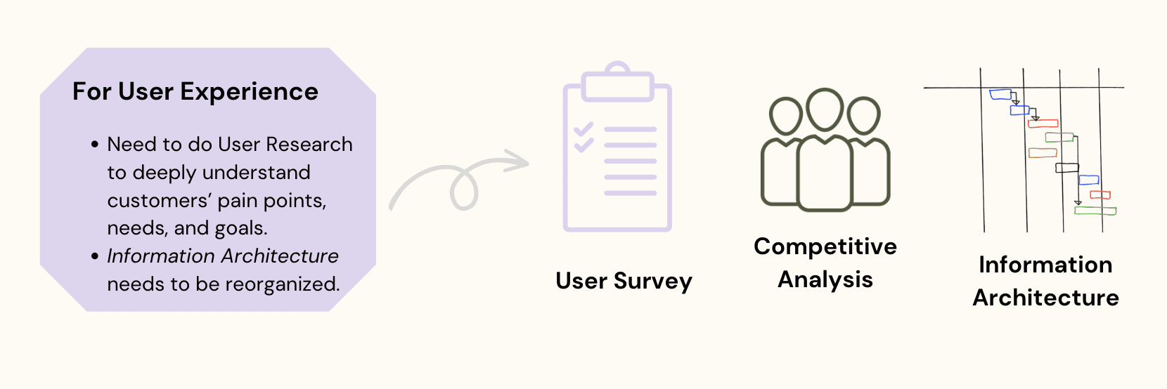
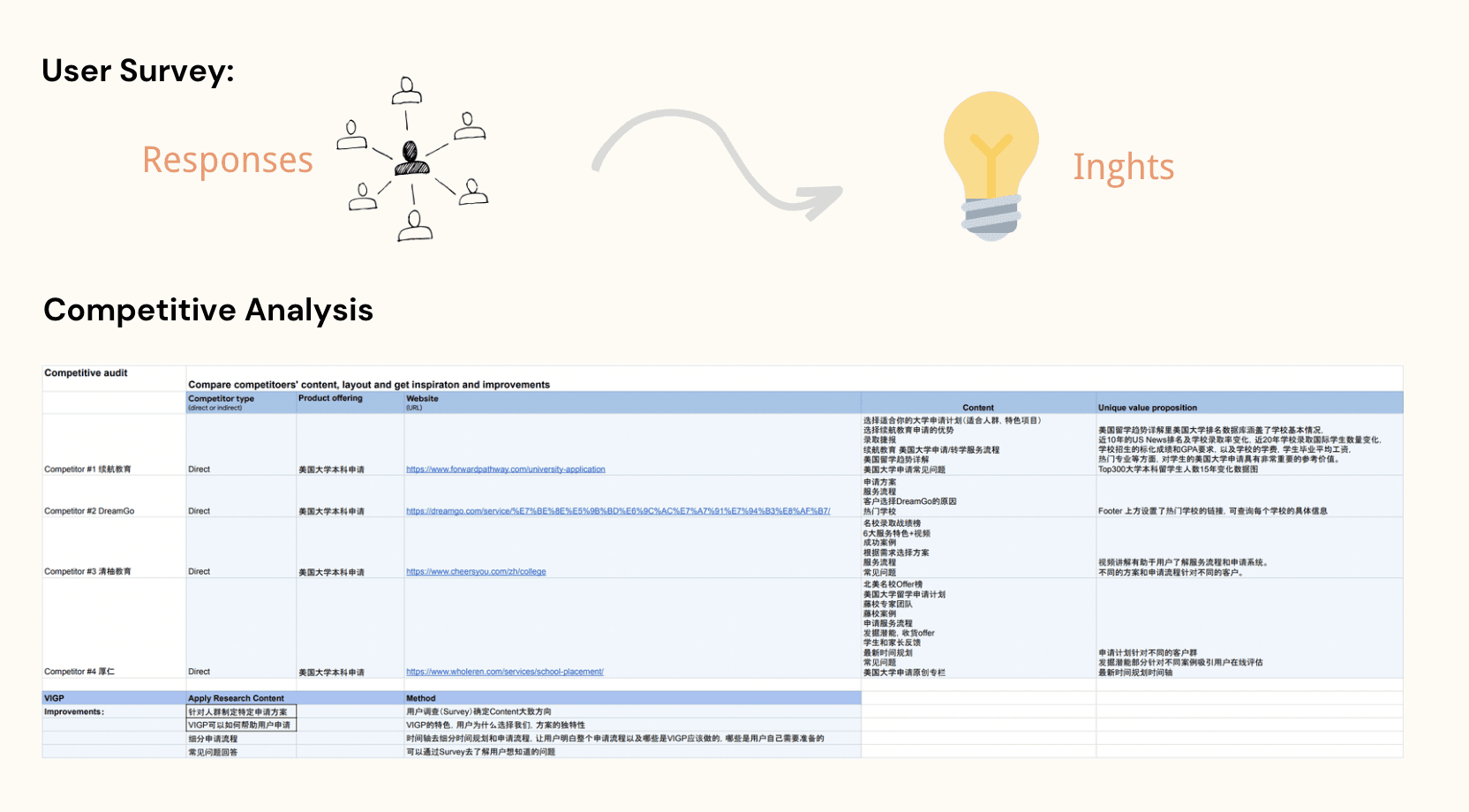
I ran interviews with prospective students, current applicants, and the in-house counseling team. In parallel, I audited the existing site's analytics — bounce rates by section, paths to inquiry, and search terms students used to find the site.
The qualitative work surfaced motivations and confusion; the quantitative work confirmed which pages were doing the most work, and which were silently failing.
Insights
Students didn't need more.
They needed a path.
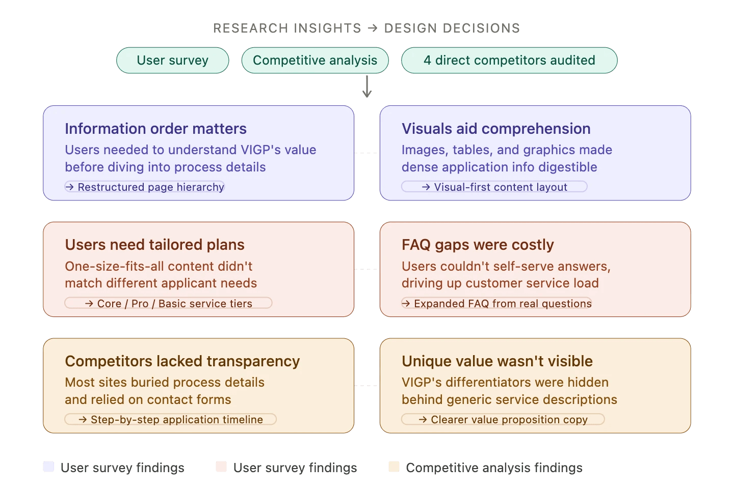
The strongest pattern: prospective students rarely came in knowing which program they wanted. They came in with a goal — "study in the U.S." — and needed help translating that into a specific program, a specific timeline, and a specific next step.
The site had answers buried in long pages. What it didn't have was a structured path that started with the student's goal and progressively narrowed to action.
Four Questions
Designing around
what students actually ask.
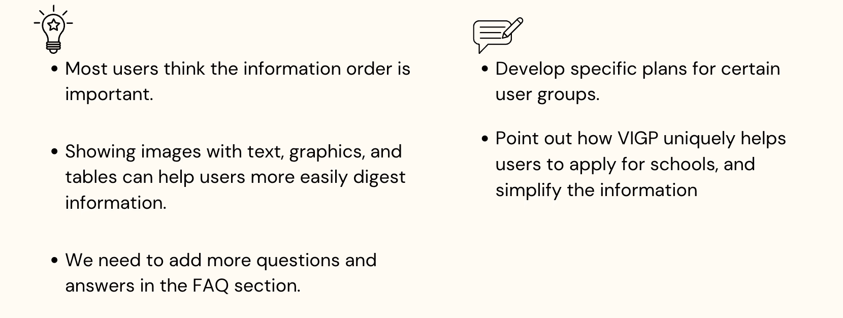
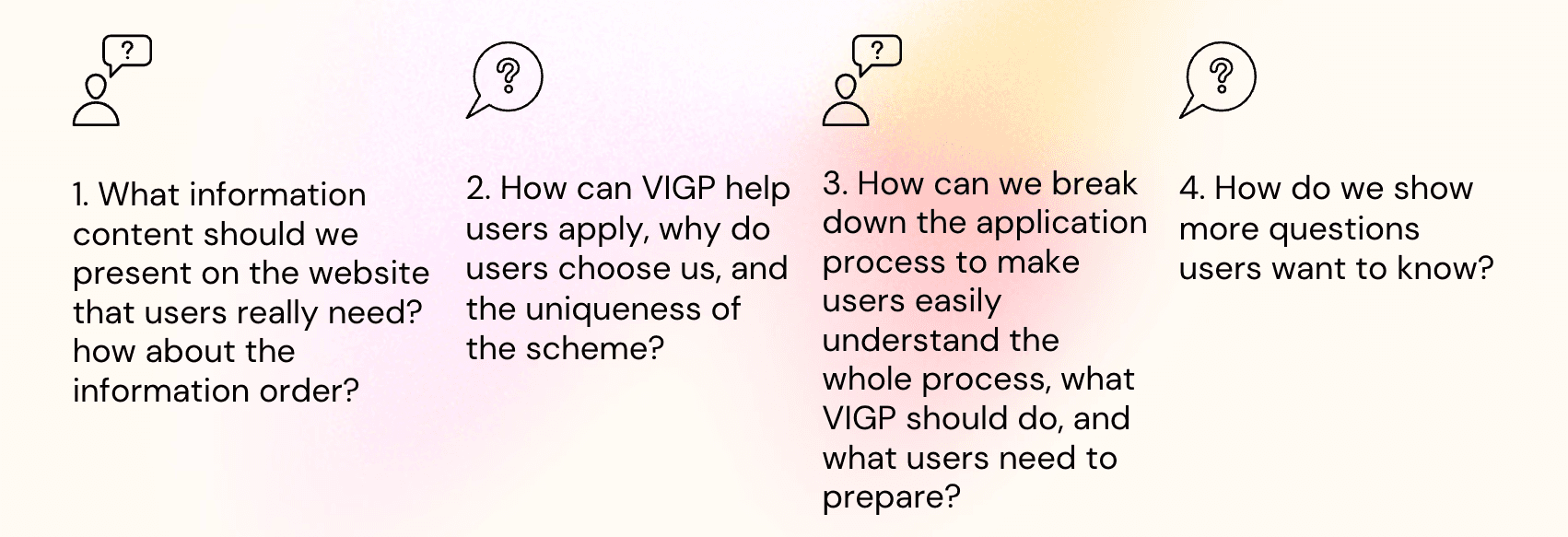
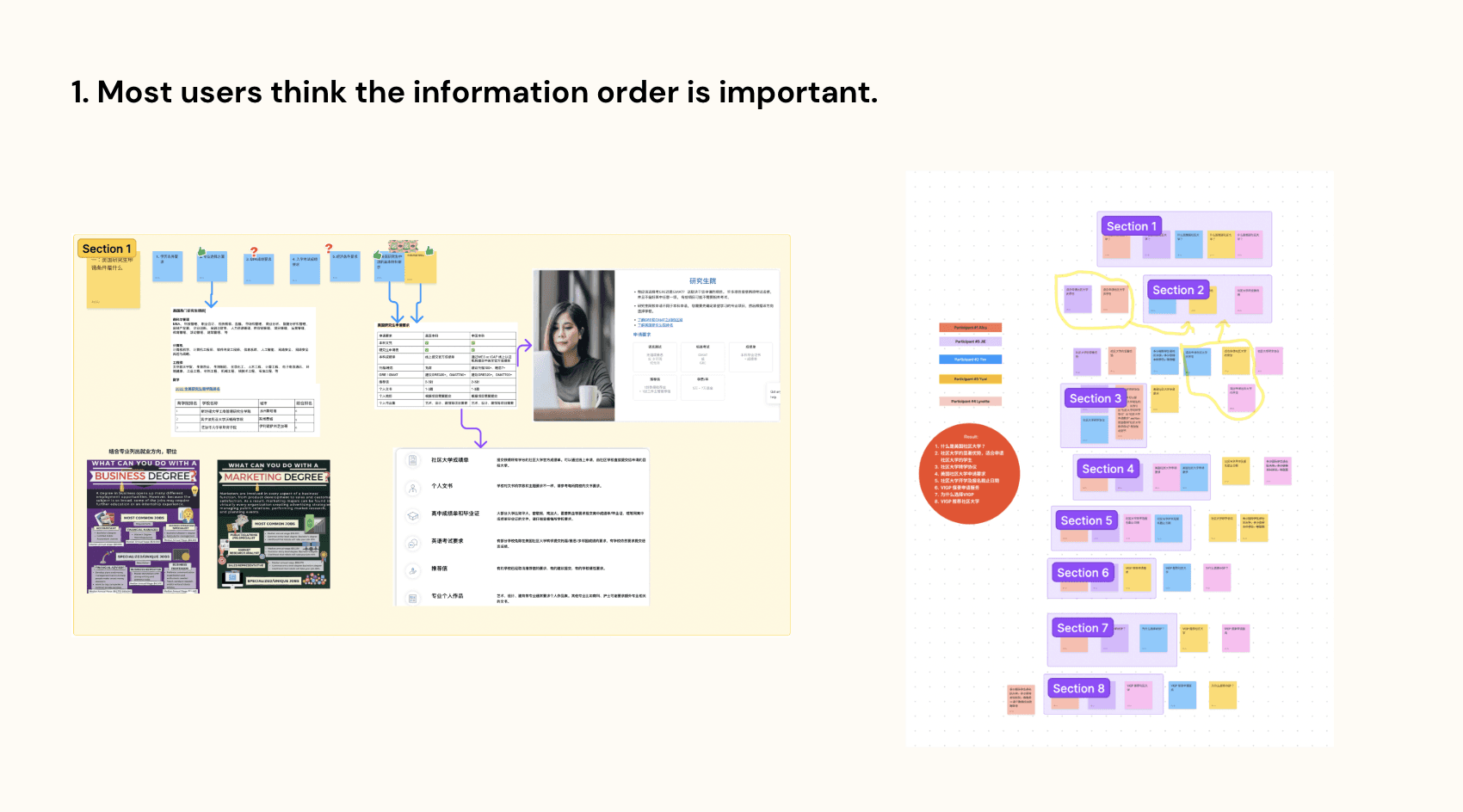
Instead of organizing the site by service categories (the way the business saw itself), I restructured it around the four questions students were already asking — answered in the order they were ready to ask them.
Each question became a section, each section had a clear next step, and the path from "browsing" to "qualified inquiry" became something a first-time applicant could actually follow.
Is this for me?
The homepage answers the very first question — who this platform is for, what kinds of students it serves, and what kinds of outcomes it delivers — before asking for any commitment.
Which program fits?
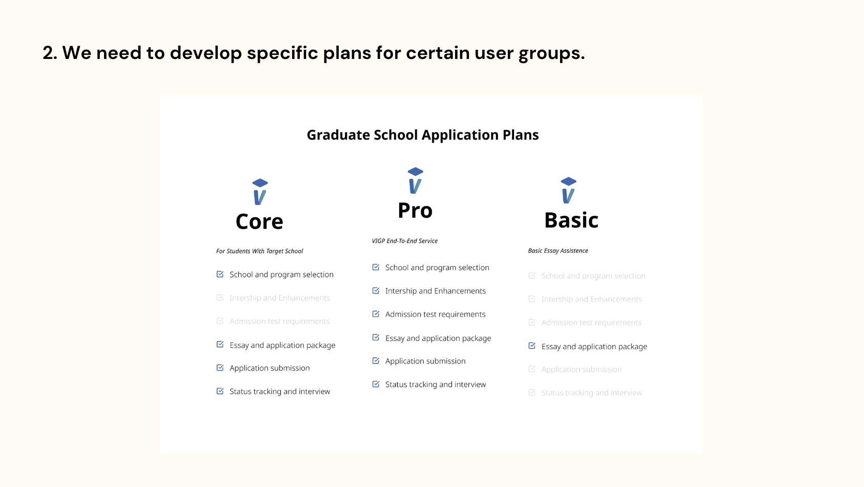
A structured program directory lets students filter by goal (degree level, field, timeline) and compare options at a glance — instead of scrolling through long descriptive pages.
How does it work?
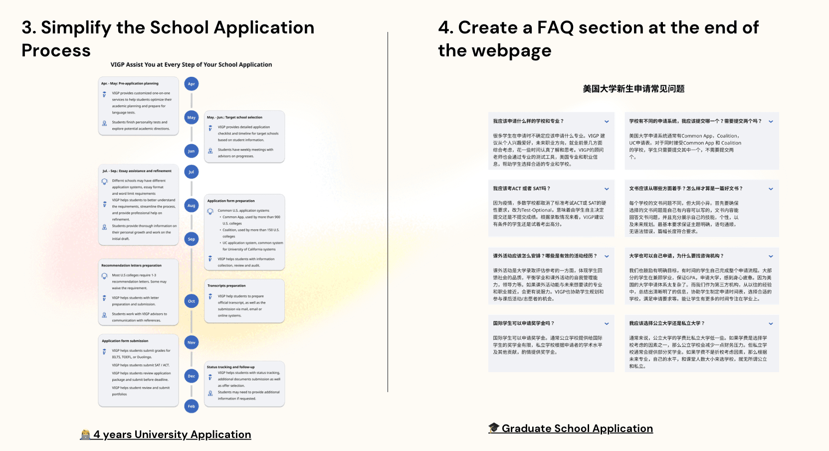
A timeline-based service overview replaces dense feature lists. Students can see the application journey end-to-end and locate themselves on it before they commit to a conversation.
Can I trust this?
Counselor profiles, success stories, and a transparent breakdown of what's included built credibility before the inquiry form — addressing the concern that ultimately blocks first-time international applicants.
Architecture
Fewer pages.
Clearer hierarchy.
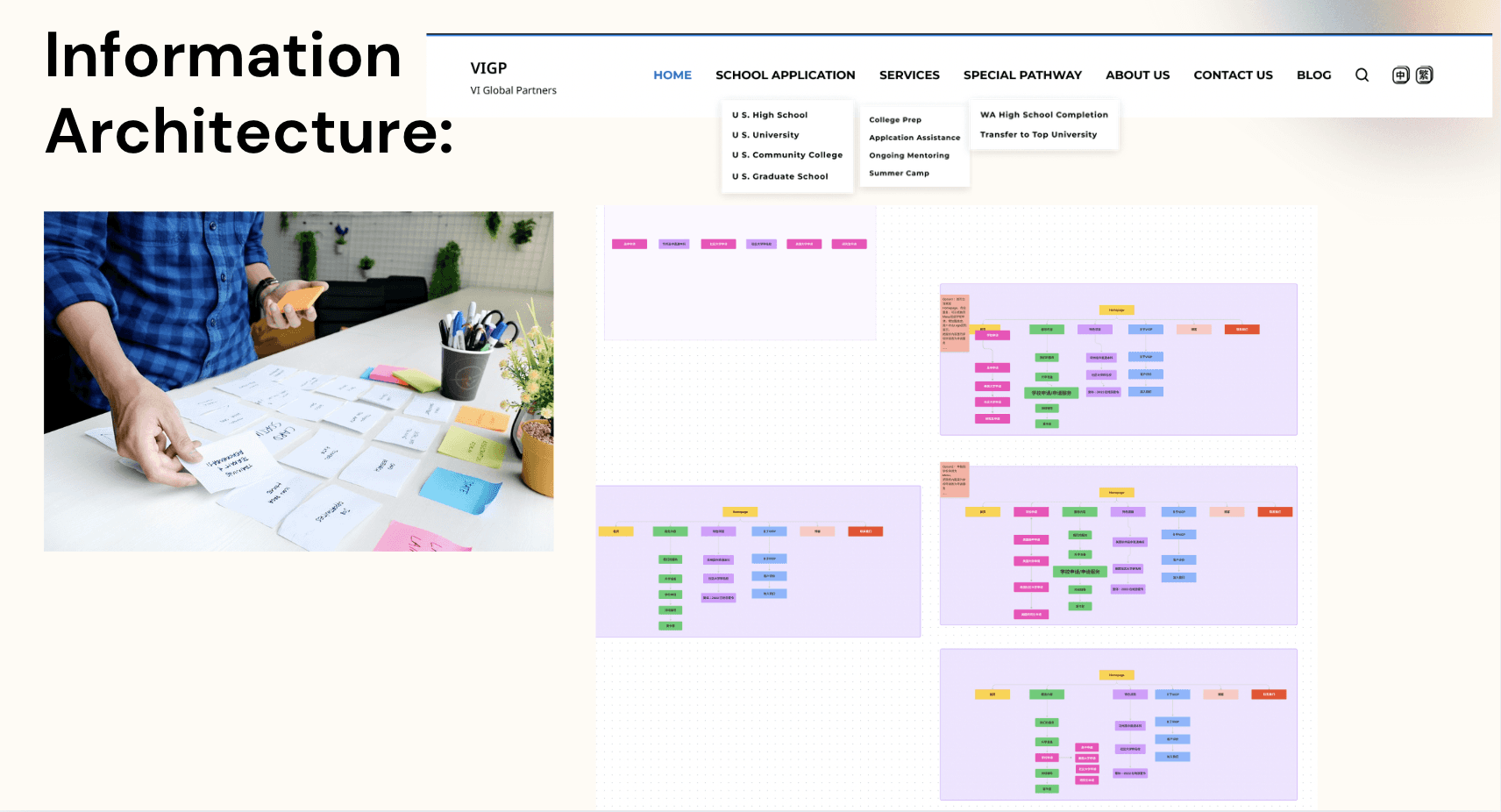
The redesigned IA collapsed scattered service pages into four primary sections aligned with the four questions, with a clear primary action at every level. Navigation became predictable: the same pattern on every page, no dead ends.
Visual System
Editorial calm,
not brochure noise.
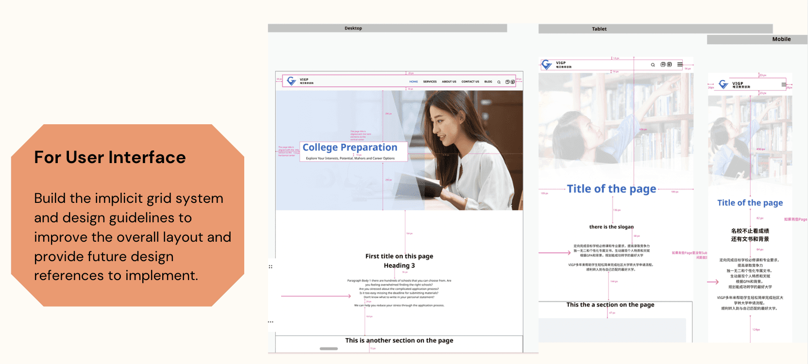
The visual language moved away from stock-photo-heavy education-marketing tropes and toward something more editorial — quieter typography, generous whitespace, real photography of students and counselors, and a warm, considered palette.
The goal was a tone that felt trustworthy to a first-time international applicant deciding whether to take the next step.
Outcome
From browsing to action.
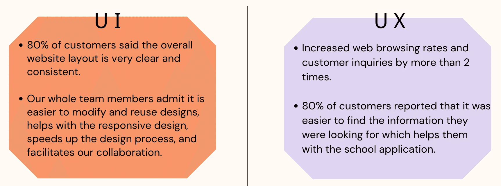
After launch, qualified inquiry volume roughly doubled within the first quarter — the same audience converting at a higher rate because the path forward was finally clear. Bounce on top entry pages dropped, and the counseling team reported that incoming inquiries arrived with better context, shortening initial calls.
The companion mobile app extended the relationship past the inquiry: ongoing program updates, document checklists, and a direct line to assigned counselors.
2×
Qualified inquiry volume in the first quarter post-launch
34%
Bounce rate on top entry pages
2
Surfaces — marketing site & companion mobile app
4
Sections, organized around the questions students actually ask
What I Learned
The hardest part wasn't the site.
It was the order of the questions.
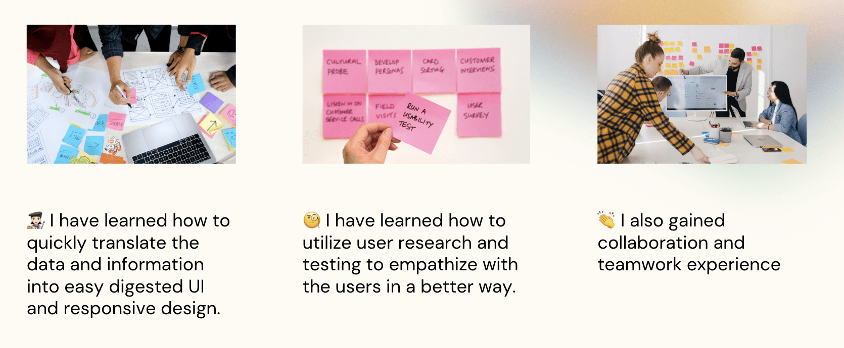
Information architecture is empathy. The old site organized content the way the business saw itself; the redesign organized content the way students were already thinking. That single shift did more for conversion than any visual upgrade.
Trust is a design problem. First-time international applicants don't bounce because the site is ugly — they bounce because they can't tell whether to believe it. Counselor profiles, transparent process, and real photography did more than another testimonial slider ever could.
One product, two surfaces. Designing the marketing site and the companion app together — same language, same hierarchy, same warmth — let the relationship continue past the inquiry instead of ending at it.
Organize content the way users already think — not the way the business sees itself.
Shipped and live across three languages.
A multilingual platform helping international students navigate U.S. university applications and resources.