LUMISKIN —
Beauty Spa Booking Site
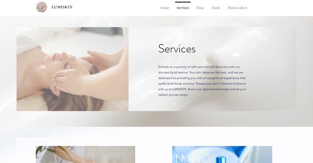
An end-to-end design and launch of a service booking website for a solo-founder skincare studio in Bellevue, WA. The site replaced manual, word-of-mouth bookings with a calm, premium digital experience — and three years on, it's still the only way clients book.
Background
A solo-founder business with
no digital presence.
LUMISKIN is a beauty spa startup founded by a solo entrepreneur. Before the website, the business had no online presence — service information was communicated manually, and every booking happened offline through phone or in-person conversation.
The founder needed two things at once: a way to establish her brand online, and a way to convert first-time visitors into paying customers without holding their hand through the process.
Problem
Word-of-mouth has
a ceiling.
Without a digital platform, prospective customers had no way to discover services, compare options, or book on their own. Every inquiry routed through the founder personally — a bottleneck for the business and a friction point for customers who simply wanted to book a facial on a Tuesday night.
Approach
Working closely with
the founder.
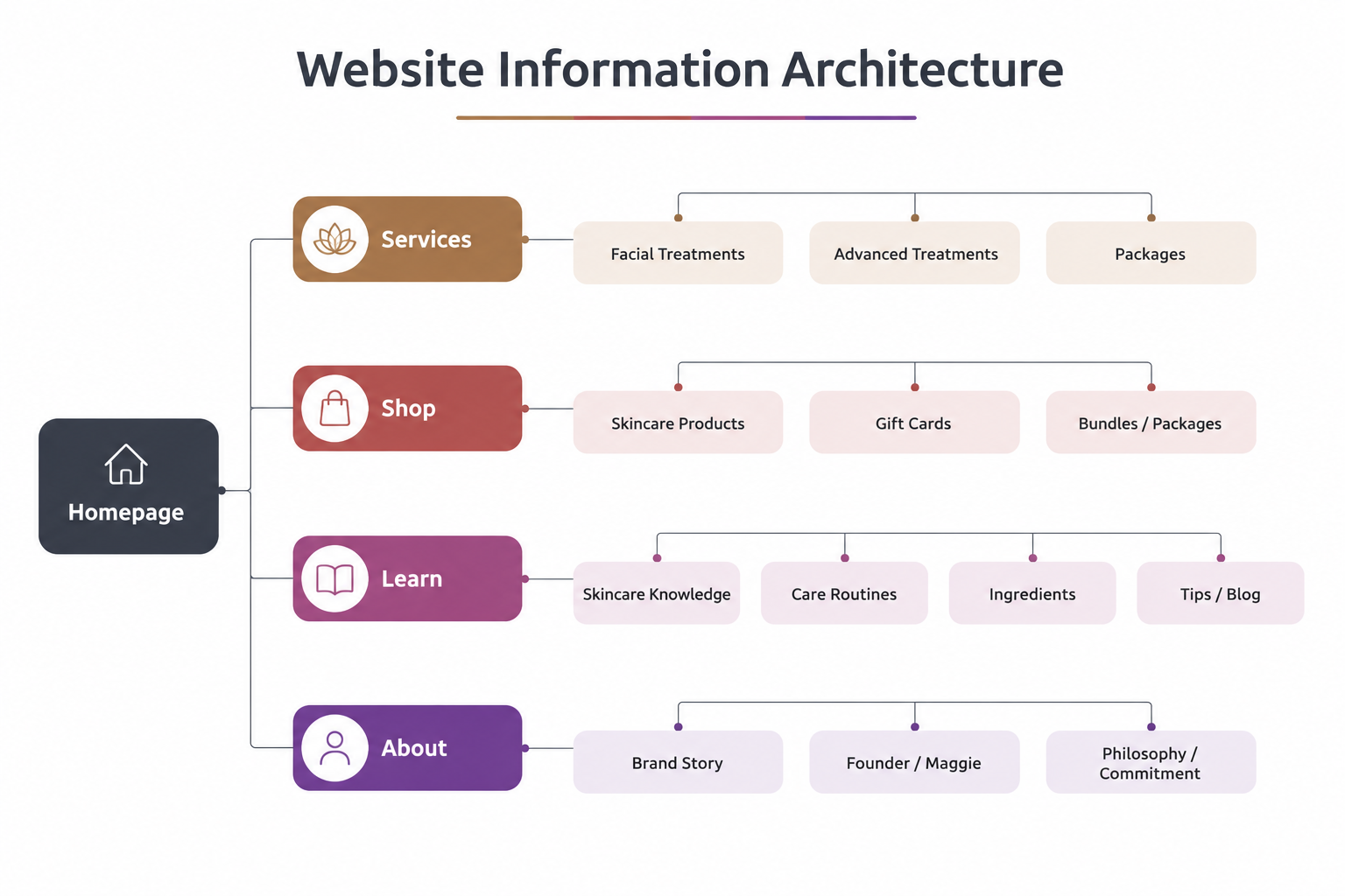
I worked directly with the founder to understand her business goals, target audience, and brand vision. In parallel, I reviewed how comparable spa and wellness businesses presented their services online — looking specifically for patterns and gaps in how services were described and how easily users could move from discovery to booking.
Insights
Three insights that
shaped the direction.
Educate, not just sell.
Clients ranged from skincare enthusiasts to complete novices. The site needed to teach a first-time visitor what each treatment is and why it matters — before asking them to book.
Trust precedes booking.
For a wellness service, aesthetics aren't decorative — they're qualifying. The brand had to feel premium and calm before a stranger would commit money and an hour of their day.
Self-serve, end-to-end.
The booking process had to be simple enough to complete without any assistance — because the entire goal was removing the founder from the booking loop.
Three Goals
Quiet, premium,
self-serve.
The three insights translated into three design goals — used as the lens for every decision from layout to typography to copy length.
Quick comprehension.
Help first-time visitors understand the full menu of services within seconds of landing — without reading paragraphs.
Calm, premium aesthetic.
Build trust through visual consistency. Soft palette, generous whitespace, real photography — no stock-photo wellness clichés.
Frictionless booking.
From service interest to confirmed appointment in as few steps as possible — completable on a phone, between meetings, without a phone call.
Service Model
Same shape,
every service.
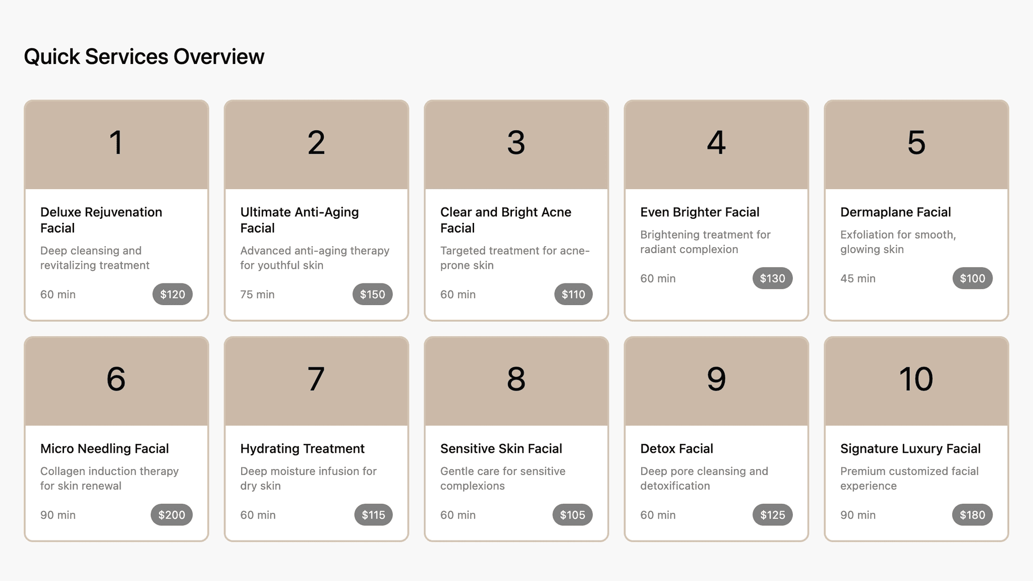
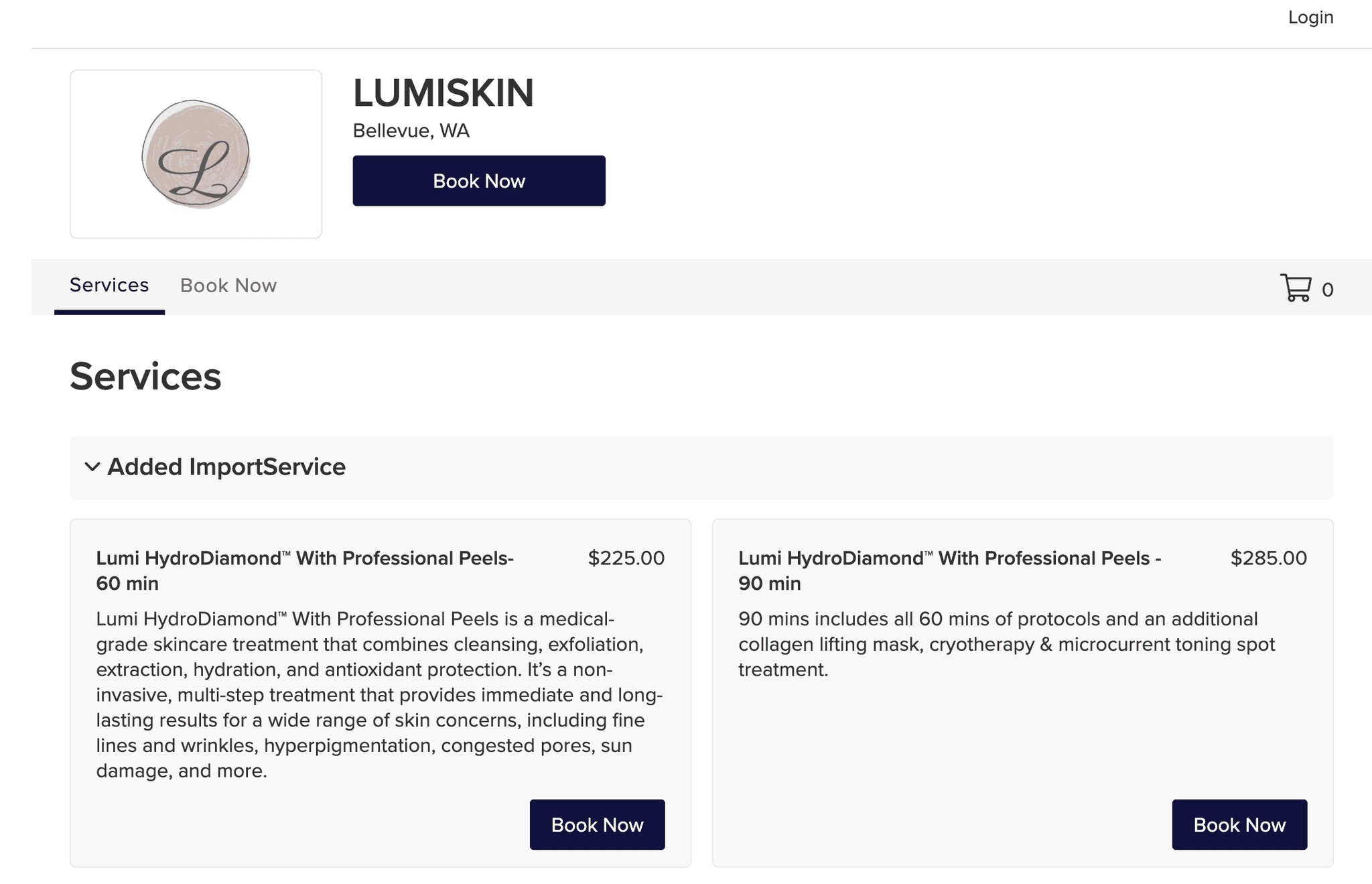
Since there was no existing structure, the first design decision was defining how a service should be presented. I introduced a single, consistent model — a clear name, key benefits, duration, and price — that every service on the site would follow.
The result: users could scan and compare options without reading everything in detail, and the founder had a template for adding new services without rebuilding pages.
Visual System
Designed for the scan,
not the read.
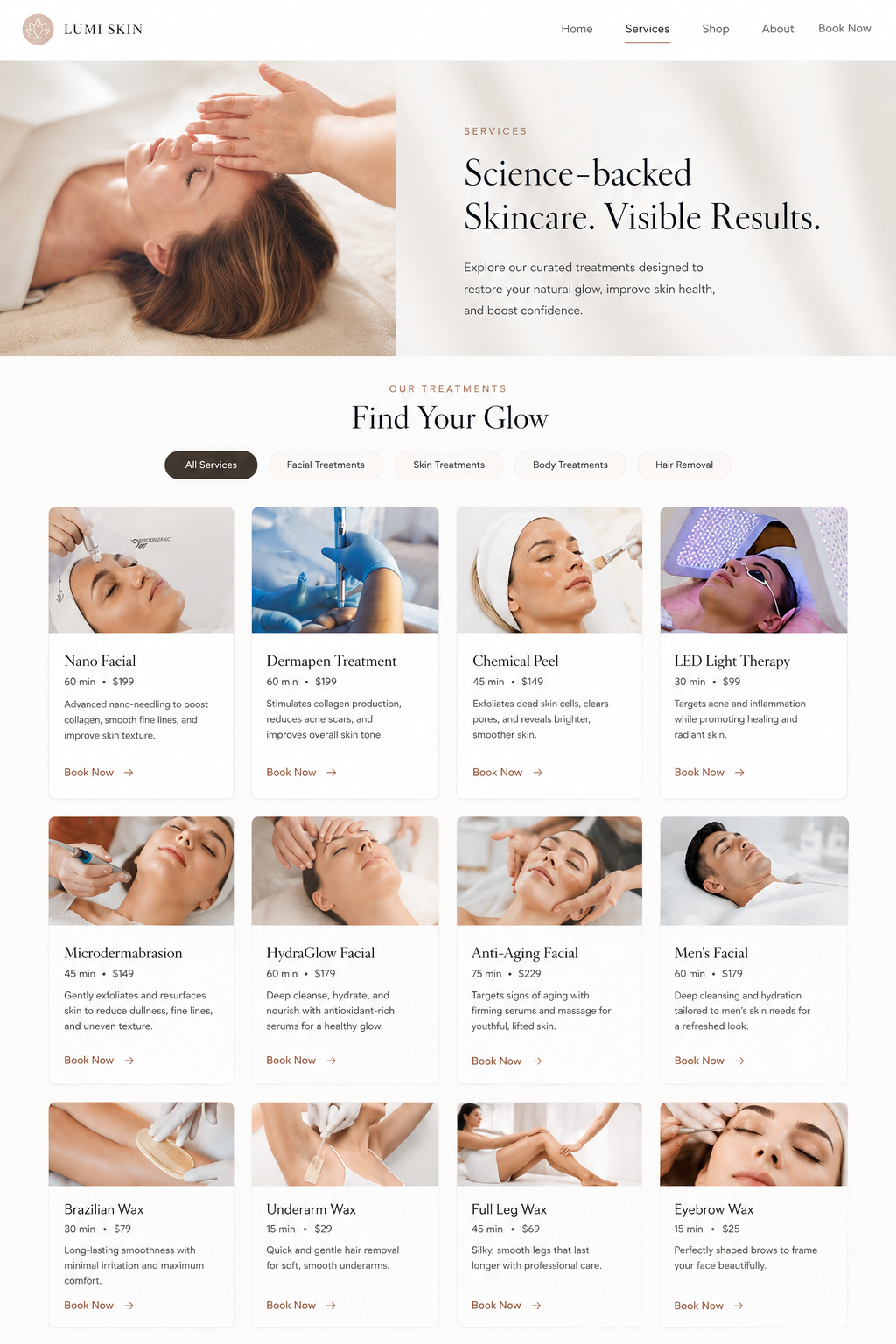
Services live in a grid that supports quick visual comparison. A consistent card pattern carries the service model across the whole site — the same name treatment, the same way duration and price are surfaced, the same proportions of image to text.
Key details — price, duration, treatment type — are surfaced upfront. Descriptions stay concise. Visual cues differentiate similar services so a first-time visitor can choose with confidence instead of hesitation.
From Interest to Action
The shortest line
from browsing to booked.
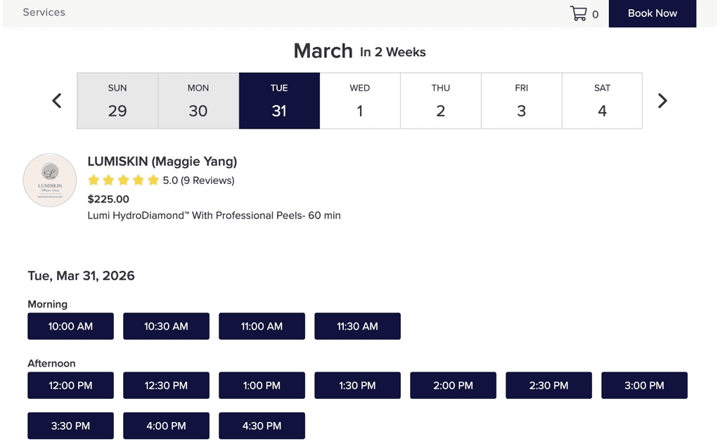
The booking experience was designed to be simple and guided. A clear call-to-action lives on every service. Steps are minimal — pick a service, pick a time, confirm. There's no separate "request appointment" detour, no intermediate human approval, no waiting for an email reply.
The goal was a seamless transition from interest to action that felt like part of the same gesture.
Three Years In
From manual scheduling
to daily bookings.
The site launched in 2022 and has been running for three years. Since launch, every customer booking comes through the website — the founder no longer handles any scheduling manually. The business sees appointments nearly every day and has built a strong base of returning customers.
Clients consistently describe the site as beautiful, on-brand, and easy to navigate. The redesign reduced manual scheduling to zero, clarified services and pricing, and gave the business a scalable foundation for future marketing.
100%
of customer bookings now flow through the site
3 yrs
live and operating with zero redesigns required
0
manual bookings handled by the founder post-launch
80%
steady base of returning customers built over time
What I Learned
The structure had to come
before the aesthetic.
Defining a service model first changed everything. Once every service had the same shape — name, benefits, duration, price — the layout, the flow, and even the founder's content workflow all became simpler. The visual design had something predictable to dress.
Calm is a feature, not a finish. For a wellness brand, restraint isn't a stylistic choice — it's the actual product. Generous whitespace, soft typography, and real photography did more for trust than any amount of testimonial scrolling could.
The best digital tool is the one the owner forgets to think about. Three years in, the founder doesn't manage bookings — the site does. That's the win.
The site is still running, three years on.
It's the founder's only booking channel and continues to handle every appointment without manual intervention. Visit the live experience.